
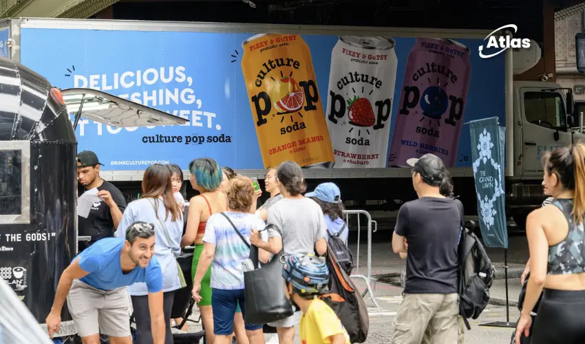
How Culture Pop Can Turn Its Colorful Brand Identity Into OOH Recognition
Walk into almost any grocery store and the beverage section immediately demonstrates how difficult the category has become.
Shoppers are presented with traditional soda, sparkling water, functional drinks, energy products, probiotic beverages and countless flavor variations competing within the same limited field of vision.

In that environment, a good product is not enough.
A brand also needs to be recognized quickly, understood easily and remembered after the shopper leaves the aisle.
Culture Pop Soda enters that competition with a valuable advantage: a visual identity and personality that already feel clear, colorful and consistent.
A strong identity before the media campaign begins
Culture Pop’s cans use bright colors and graphic packaging that can be distinguished from many of the more minimal or health-clinical designs common within the modern beverage category.
The identity feels cheerful without becoming childish and approachable without losing its sense of quality.
New flavors, including Raspberry Lemonade, can enter the range while still looking unmistakably connected to the wider brand.
This consistency matters because recognition is built through repetition. Every can, social post, retail display and advertisement contributes to the same memory structure.

A beverage brand with a recognizable personality
Culture Pop’s identity is not limited to its packaging.
The brand presents itself as friendly, energetic and socially open. It feels like the person at a gathering who notices someone standing alone and invites them to join the group.
That personality is valuable because it gives consumers a reason to understand the brand beyond flavor or product function.
Many beverages can claim to taste refreshing. Fewer create a personality audiences can describe in human terms.
The ability to imagine Culture Pop as a person suggests that the brand has developed a coherent tone across design, language and behavior.
Real people make the brand feel more approachable
Culture Pop’s social content reinforces that personality by showing recognizable employees and real people behind the company.
The brand does not feel like a logo publishing anonymous promotional messages.
Its videos introduce the team, use humor and create situations that feel spontaneous rather than overproduced.
Inviting an unexpected mix of strangers into the office to try Culture Pop—including a reptile handler, an a cappella group and Buddy the Elf—shows a brand comfortable with entertainment and self-awareness.
This human presence helps audiences understand the personality of the company, but it creates a strategic question:
How can shoppers recognize all of that personality when they only see the can for a few seconds on a crowded shelf?
The shelf cannot carry the entire brand story
Packaging is one of the most important media channels for a consumer product, but it works within severe limitations.
Shoppers may see the can from a distance, partially blocked by other products or surrounded by competing colors and claims.
They may not know the social content, the employees or the sense of humor behind the brand.
The package must therefore perform several tasks at once:
- Identify the brand.
- Communicate the flavor.
- Suggest the product experience.
- Compete visually with nearby options.
- Give the shopper enough confidence to try something unfamiliar.
That is a lot to ask from one can during a short purchase decision.
OOH can create recognition before the store visit
Outdoor advertising can help by introducing Culture Pop before shoppers reach the beverage aisle.
Repeated exposure to the brand’s colors, can design and personality creates familiarity over time.
When the consumer later sees Culture Pop inside a grocery store, the package no longer feels completely unknown.
Repeated exposure reduces the risk of trial
Trying a new beverage is a relatively small decision, but consumers still rely on familiarity.
A product seen repeatedly across city streets, transit routes or retail corridors can begin to feel established even before the first purchase.
This is especially important for challenger brands competing against products with larger distribution and longer histories.
OOH can build that familiarity through:
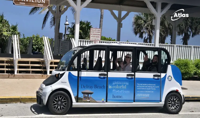
- Transit placements: Reaching consumers repeatedly along everyday commutes.
- Retail proximity media: Creating recognition close to grocery stores and convenience locations.
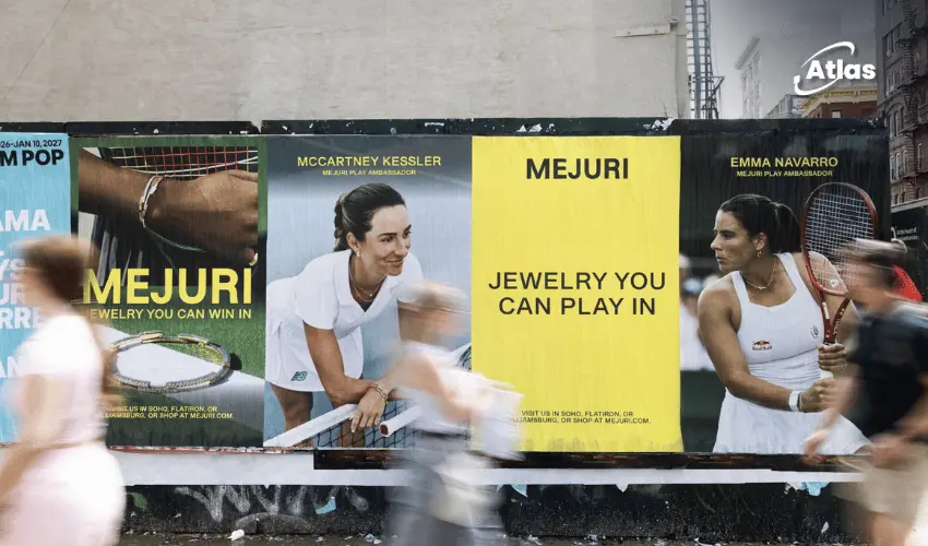
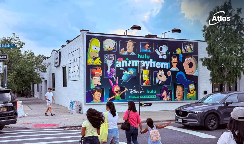
- Street-level posters: Giving the can design visibility at pedestrian distance.
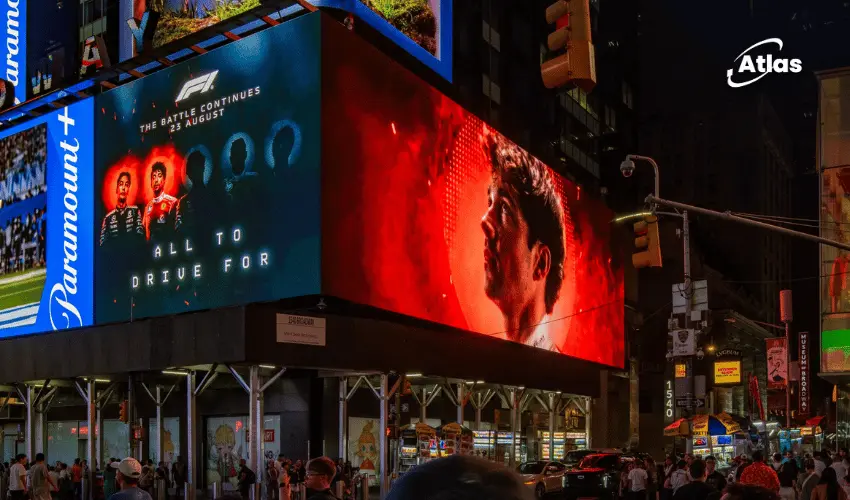
- Digital screens: Rotating flavors while maintaining one consistent brand system.
- Sampling activations: Connecting recognition with an immediate opportunity to taste the product.

Packaging should remain the hero
Culture Pop does not need to invent a completely separate visual language for outdoor advertising.
The cans already provide a strong starting point.
An effective OOH system could enlarge the packaging, use the existing color palette and combine it with concise copy that reflects the brand’s welcoming personality.
The goal should be to create a clear visual bridge between the billboard and the shelf.
If audiences remember one campaign but fail to recognize the product in-store, the media and packaging systems are not working together effectively.
Color can become a memory structure
Culture Pop’s bright colors are more than decoration.
They can help organize the product range and create repeated memory cues across different environments.
A Raspberry Lemonade execution may use one dominant combination, while another flavor uses a different palette. However, typography, composition and product presentation can preserve overall brand recognition.
This creates variety without fragmentation.
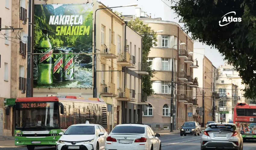
Large-format OOH can give those colors significantly more visual impact than they receive on a can, helping the brand stand apart from the neutral tones of the city environment.
Comments
Share your take. Keep it constructive and specific.