
Quick Answer
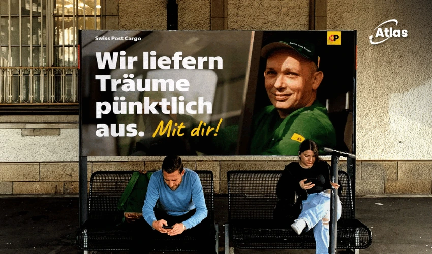
Swiss Post worked with Swiss Typefaces for more than three years to create Swiss Post Sans, a custom font designed to preserve existing layouts while making the brand feel warmer and more approachable. The typeface supports four Swiss national languages and is used across signage, transit environments, outdoor advertising and digital touchpoints.
Swiss Post Sans Brings a Warmer Identity to Outdoor Advertising
What if a custom typeface succeeds precisely because it does not demand attention? That idea shaped Swiss Post Sans, a corporate font developed by Swiss Typefaces for Swiss Post.
The project took more than three years to complete. Its purpose was to modernize a familiar national institution without disrupting existing designs. Rather than introducing an exaggerated aesthetic, Swiss Post focused on clarity, legibility and a more welcoming personality across OOH Advertising, corporate communications and everyday services.
As detailed in Creative Boom's November 2026 case study, the original brief called for a typeface so naturally integrated that most people would not notice the transition.
Why Swiss Post Sans Matters for OOH Advertising and Public Signage
A national postal brand communicates across many different surfaces, including delivery vehicles, street signs, mailboxes, service counters, transit facilities, websites and mobile applications. The same lettering must remain understandable at small sizes and recognizable when enlarged for Out-of-Home Advertising.
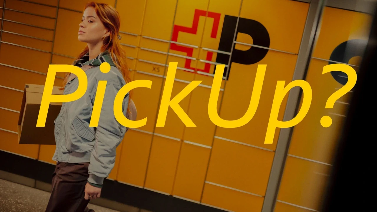
One demanding requirement shaped the entire design: Swiss Post needed to replace the previous typeface by swapping font files, without reworking existing layouts. To make that possible, Swiss Typefaces preserved the original typeface's overall typographic volume, keeping text and spacing compatible with established materials.
That makes this project especially relevant to Outdoor Media and large-scale brand systems. Consistency is not merely an aesthetic preference; it also helps organizations update thousands of public-facing placements more efficiently.
Explore how Atlas OOH approaches location strategy, brand consistency and outdoor campaign planning.
Multilingual Typography Improves Transit Advertising and Wayfinding
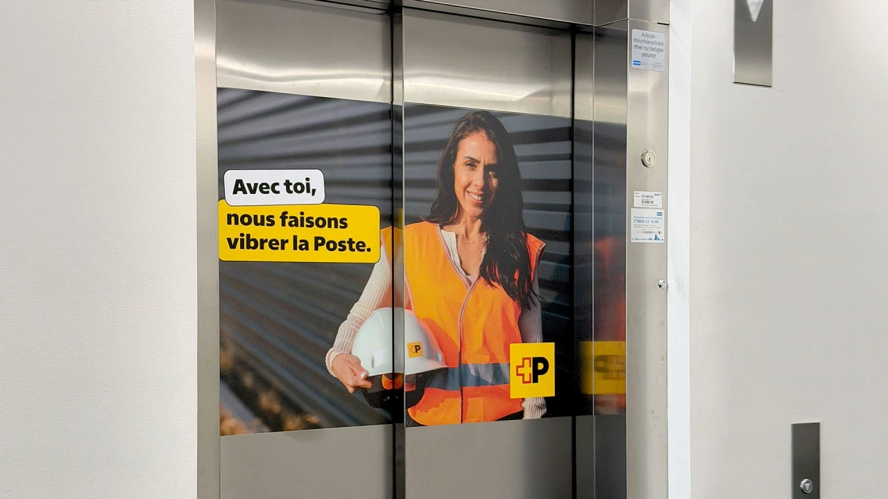
Swiss Post Sans needed to support Switzerland's four national languages: German, French, Italian and Romansh. Each accent, glyph and spacing decision had to work across public communications so that the system would remain legible and dependable.
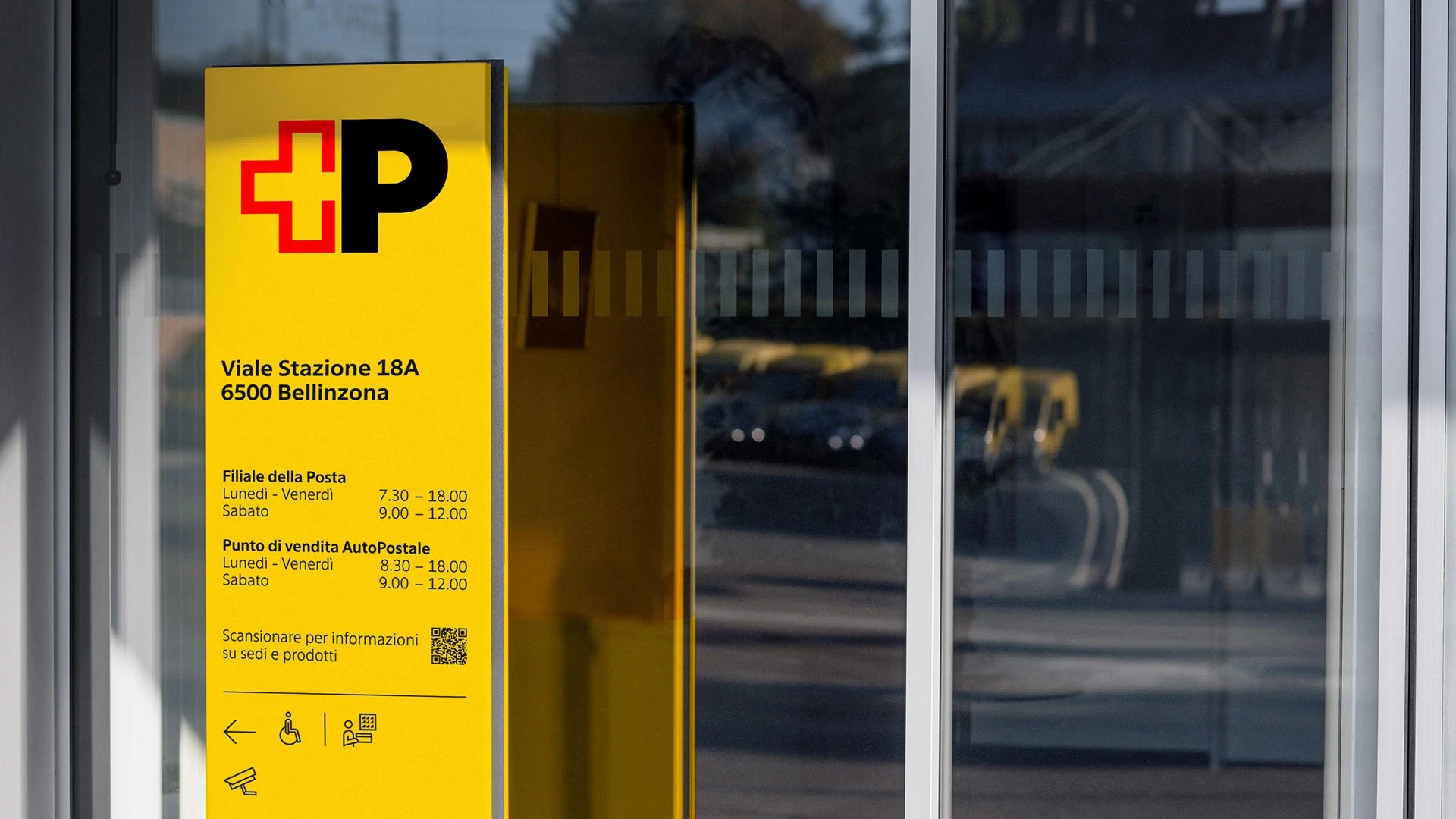
The team also developed tabular numerals as a default feature. This helps prices, schedules and opening hours align neatly in columns—an important practical requirement for Transit Advertising, transport information and service signage.
Subtle changes softened the typeface. Humanist details introduced warmer shapes, while rounded dots replaced square dots on letters such as i and j. These choices make the font friendlier without compromising the clear, reliable character associated with Swiss public design.
Italic Lettering Gives Swiss Post a Flexible Billboard Advertising Voice
While the upright styles had to remain compatible with earlier layouts, the italic family offered more freedom. Instead of merely slanting the upright characters, Swiss Typefaces introduced cursive qualities into selected letters and combined softer curves with precise endings.
The resulting italics can give headlines greater energy across Billboard Advertising, Street Furniture Advertising and larger-format brand applications. This flexibility allows a consistent identity to express both institutional reliability and a more human tone.
The design lesson extends beyond typography: effective OOH Marketing should adapt its hierarchy, scale and visual rhythm to the environment where people encounter the message.
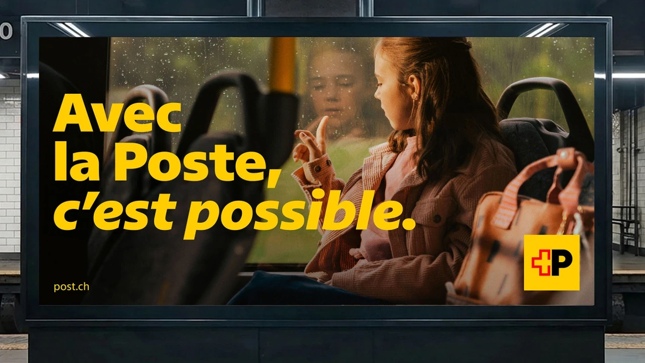
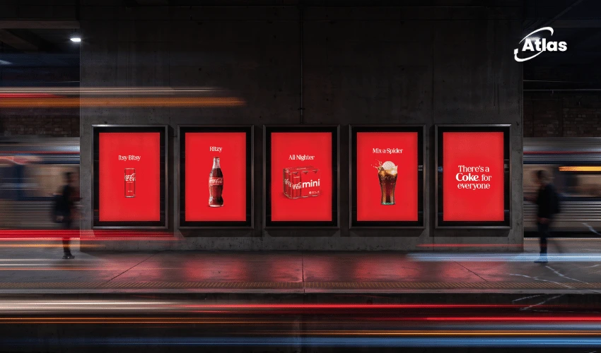
Explore transit and street-furniture advertising with Atlas OOH
Atlas OOH View: Five Lessons From Swiss Post Sans
- Lead with legibility. An OOH campaign must communicate clearly, whether viewed from a sidewalk, a platform or a moving vehicle.
- Design for every scale. A brand system should perform on small signs as well as large-format billboards and digital displays.
- Keep the transition consistent. Preserving existing layout compatibility can help a brand introduce a refreshed visual identity with fewer disruptions.
- Consider multilingual audiences. Regional context, accents and information-heavy formats matter when planning international outdoor media.
- Use typography to build recognition. Repeated lettering, color and tone help turn different placements into one recognizable identity.
Plan Brand-Led OOH Campaigns With Atlas OOH
Swiss Post Sans shows that great Creative OOH does not always need an elaborate spectacle. Thoughtful design can help a brand become easier to recognize, simpler to navigate and more consistent across the real world.
From Outdoor Billboards to Transit Advertising and Street Furniture Advertising, the same principle applies: match the message, format and visual identity to the audience's surroundings.
Plan your next OOH Advertising and brand visibility campaign with Atlas OOH.
Frequently asked questions
What is Swiss Post Sans?
Swiss Post Sans is a custom corporate typeface created by Swiss Typefaces for Swiss Post to improve visual consistency, readability and brand expression.
How long did Swiss Post Sans take to develop?
The typeface took more than three years to develop, including work on upright and italic styles and testing in real-world communication materials.
Why is Swiss Post Sans relevant to OOH Advertising?
It is designed to work consistently across outdoor advertisements, public signs, transit environments, vehicles, digital channels and other everyday brand touchpoints.
Sources
- Swiss Post Sans — Swiss Typefaces — Official project case study.
- Swiss Typefaces Crafts a Warmer, Friendlier Custom Font for Swiss Post — Creative Boom (2026-11-02).
Summary
Swiss Post Sans is a lesson in understated brand design. Rather than relying on dramatic visual changes, the typeface improves consistency and readability across physical and digital media. For OOH marketers, the project shows how well-designed typography can strengthen recognition at every public touchpoint.
Plan your OOH campaign
Get recommendations for markets, formats and availability based on your campaign goals.
Request a media plan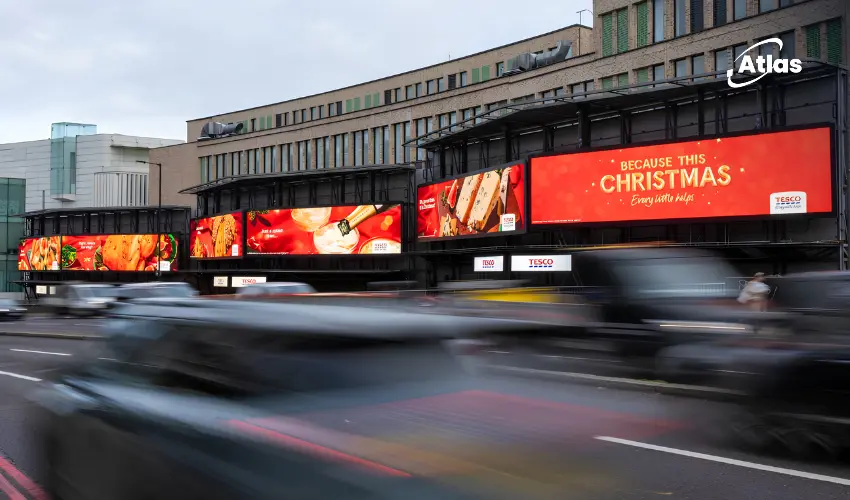
Comments
Share your take. Keep it constructive and specific.