
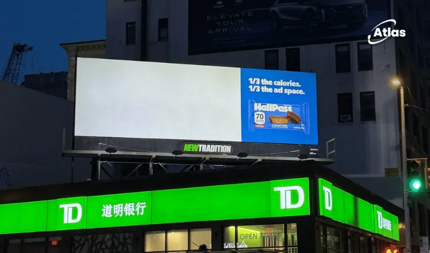
HallPass Uses Only One-Third of a Billboard to Sell One-Third the Calories
Most brands buy a billboard and try to fill every available inch of space. HallPass did the opposite for its recent NYC outdoor advertising execution above Canal Street and Bowery in Chinatown.
HallPass did the opposite.
For a New York City OOH execution above Canal Street and Bowery, the candy bar brand uses only one-third of the available display area.
The remaining two-thirds stay blank.
The reason is the product claim:
1/3 the calories.
How negative space advertising turns media into the product benefit
This is what makes the idea so efficient.
The billboard is not simply carrying a message about fewer calories.
The billboard itself demonstrates the reduction.
Only one-third of the available media is used, turning proportion into communication.
Minimalism with a reason
Minimalist advertising can sometimes feel like an aesthetic choice.
Here, the emptiness has a strategic function.
The unused space is not wasted.
It is the visual proof of the claim.
That makes the blank area just as important as the designed area.
Why one-third is easy to understand at a glance
The concept works because proportion is immediate.
Audiences do not need a detailed nutritional comparison.
They can see that most of the billboard has disappeared.
The visual reduction creates the joke before the copy finishes explaining it.

Creative billboard campaign uses empty space for urban disruption
Busy urban advertising environments usually reward saturation.
More color.
More imagery.
More message.
HallPass stands out by refusing that behavior.
A mostly empty billboard becomes unusual precisely because neighboring media are likely trying to fill every available surface.
Chinatown billboard placement at Canal Street and Bowery amplifies contrast
The placement above the TD Bank branch at Canal Street and Bowery gives the execution another layer of impact.
Chinatown is visually dense.
Signs, storefronts, traffic, pedestrians and commercial messaging all compete for attention.
In that environment, a billboard dominated by negative space becomes unexpectedly visible.
The idea respects the viewing time
People moving through Canal Street do not have time for long copy.
The HallPass execution works because the audience can process it in seconds.
- Notice the unusually empty billboard.
- See that only one-third is being used.
- Read the calorie claim.
- Understand the joke.
There is almost no wasted mental effort.
Day Job turns restraint into branding
The campaign was created by Day Job, co-founded by Rion Harmon.
The execution reflects a strong confidence in the core idea.
There is no need to decorate the billboard once the proportion mechanic is doing the work.
That restraint becomes part of the brand personality.
Why this is stronger than simply writing “fewer calories”
A standard ad might communicate the same product benefit through a headline.
That would be clear.
But it would not be memorable in the same way.
HallPass makes the audience experience the reduction visually.
The difference is between telling and demonstrating.
The billboard itself becomes product proof
This is one of the strongest forms of OOH alignment.
Remove the “1/3 the calories” claim and the empty space loses its meaning.
Remove the empty space and the claim becomes much more ordinary.
The two parts depend on one another.
That is a sign of strong creative integration.
Negative space becomes a distinctive asset
Brands usually think about distinctive assets as colors, logos, characters or shapes.
This campaign briefly turns absence into one.
For the duration of the placement, emptiness becomes associated with HallPass.
That is unusual in a medium designed around visibility.
Why the execution photographs well
The concept is also easy to understand in a single image.
A photo of the billboard immediately communicates the idea even outside New York.
That gives the campaign strong potential for social and industry amplification.
- The visual is simple.
- The mechanic is obvious.
- The product claim is embedded in the composition.
- No motion or context is required to explain it.
OOH as a design problem, not just media placement
The HallPass execution is a reminder that creative teams do not always need to treat a billboard as a rectangle to fill.
The amount of space used can itself become part of the concept.
That opens up broader possibilities around:
- Proportion.
- Absence.
- Cropping.
- Physical scale.
- Intentional underuse of media.
Frequently asked questions
What is the idea behind the HallPass billboard?
The ad uses only one-third of the available billboard space while leaving the rest blank, physically mirroring HallPass's claim of having one-third the calories.
Where is the billboard located?
The billboard appears above the TD Bank branch at Canal Street and Bowery in Chinatown, Manhattan.
Who created the campaign?
The minimalist OOH execution was created by Day Job, the creative agency co-founded by Rion Harmon.
Why does the execution work?
The product claim and the media behavior are the same idea, so audiences understand the benefit visually before they need to process much copy.
Sources
- HallPass One-Third Billboard Campaign Post - Rion Harmon / Day Job
Plan your OOH campaign
Get recommendations for markets, formats and availability based on your campaign goals.
Request a media plan


Comments
Share your take. Keep it constructive and specific.