
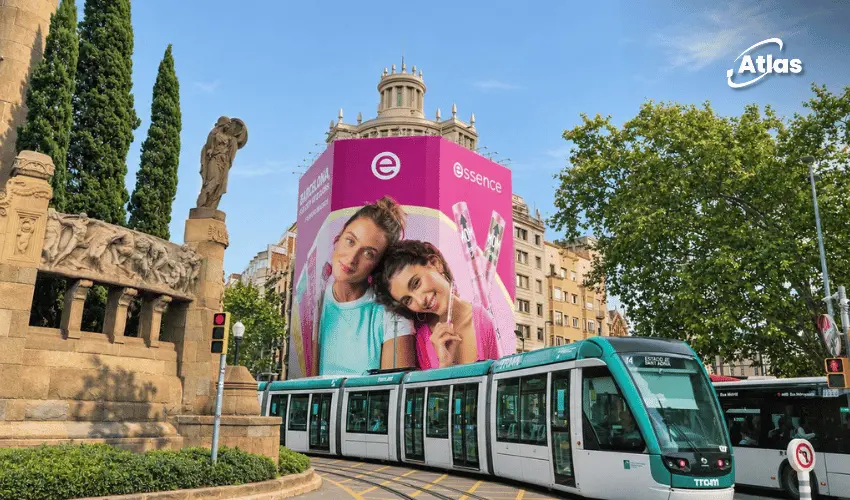
essence Brings a Wave of Pink to Barcelona Outdoor Advertising
Barcelona looks good in pink—and essence wants the city to know it. In a vivid Out-of-Home Advertising campaign, the makeup brand has moved beyond product shelves and social feeds to bring its energetic identity into streets, transit corridors and pedestrian spaces across the Catalan capital.
The campaign connects several very different media formats through one instantly recognizable idea: a saturated pink visual world, prominent essence logos, youthful beauty imagery and the Catalan line “Barcelona, et queda bé el rosa. Et queda bé essence!” In English, the message suggests that pink suits Barcelona—and so does essence.
Rather than treating a billboard, tram and bus shelter as isolated placements, the creative makes them feel like pieces of the same citywide story. Each format reaches people in a different daily moment, but the message and colors remain consistent.
A Full Pink Tram Becomes Moving Billboard Advertising
One of the campaign's most memorable executions is a long Barcelona tram covered in essence's bright magenta branding. From end to end, the vehicle features large white logos, makeup product graphics and campaign models. The repeated pink sections turn the length of the tram into a mobile visual statement.
Unlike a fixed Outdoor Billboard, Tram Advertising travels with the network. It can be seen at stops, intersections and along the route, creating different opportunities for passengers, drivers and pedestrians to notice the same branded artwork.
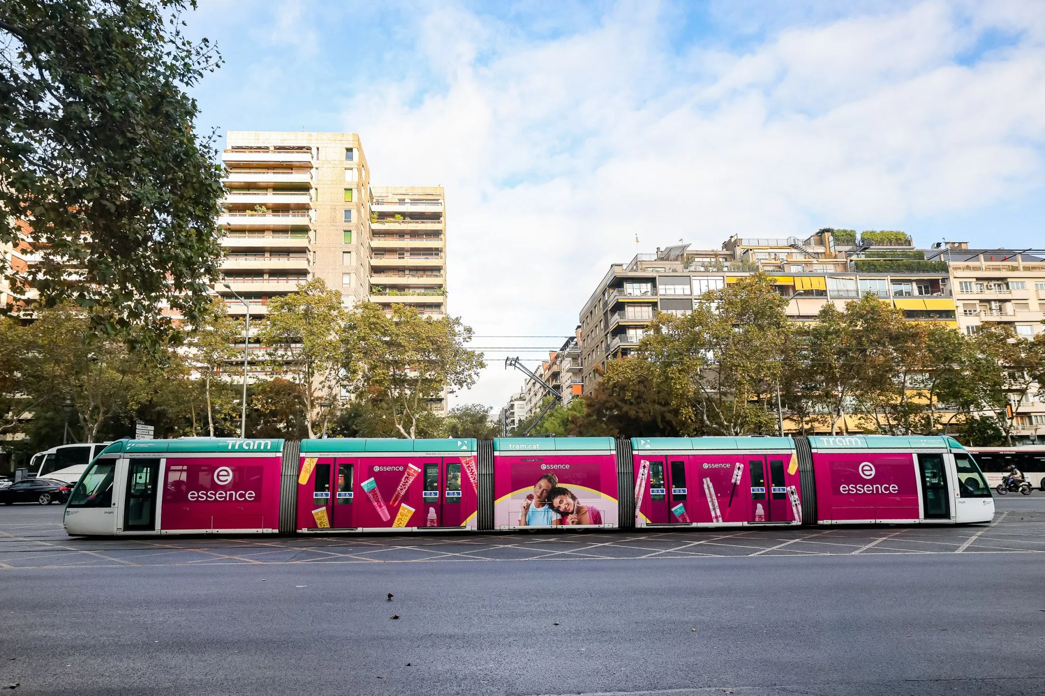
The design also suits the tram's segmented structure. Products and logos appear across the separate carriages, while the campaign models occupy a central section. Even when part of the tram is obscured, the color and repeated logo help maintain instant brand recognition.
Bus Shelter MUPIs Bring essence to Diagonal–Aribau
Another supplied image shows a pink essence MUPI inside a JCDecaux bus shelter at Diagonal–Aribau. The visible H8 route sign gives useful location context, while the advertising panel places the two campaign models under the Catalan headline.
This is a different form of Street Furniture Advertising from the tram. The poster is fixed in a waiting environment, where people have more time to notice the slogan, makeup looks and brand details. Its placement brings the campaign into an ordinary public-transport routine.
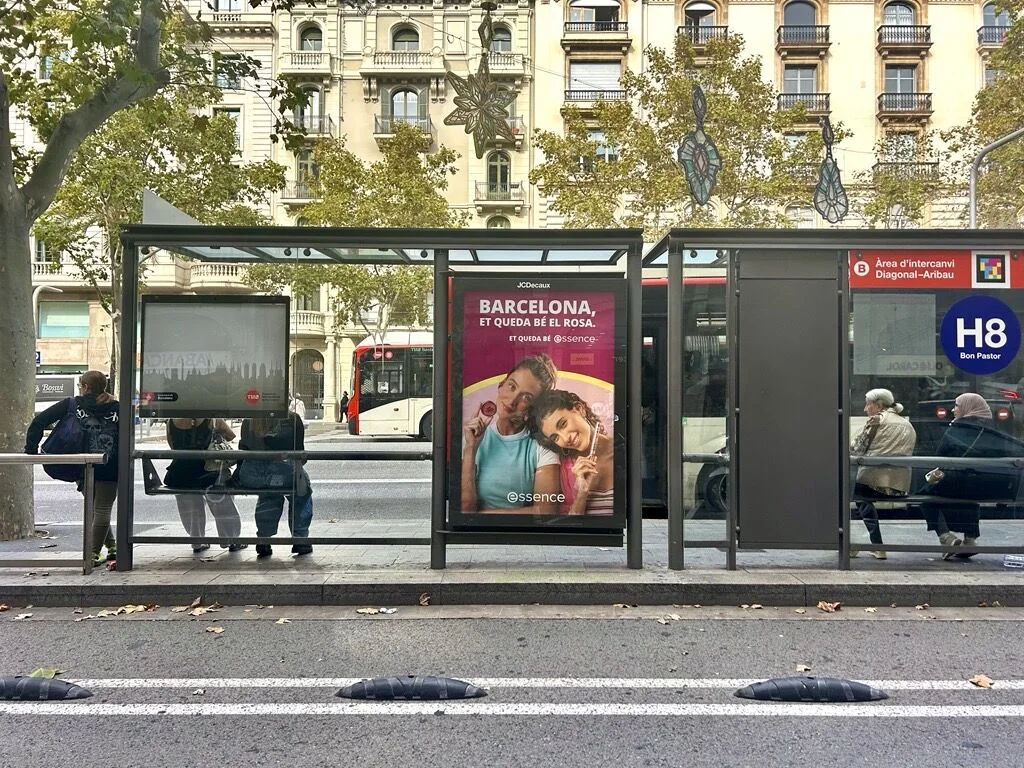
The bus shelter format complements the moving vehicle wrap. One ad creates a large moving presence; the other gives audiences a closer, stationary view. For Location-Based Advertising, this mix can help the brand meet consumers at different points in their city journeys.
A Giant Building Wrap Adds Large-Format OOH Impact
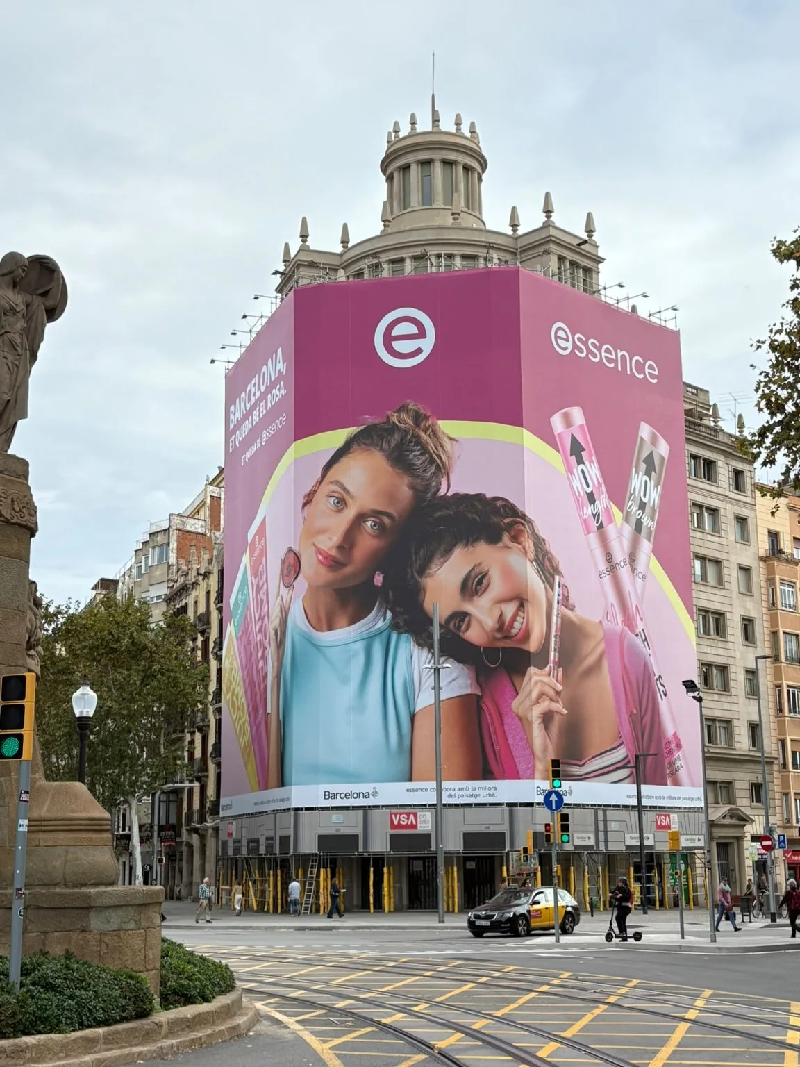
The campaign's most architectural execution is a huge pink wrap covering the corner of a multi-story building. The vibrant surface carries the essence logo, makeup products and two large campaign portraits, extending the artwork high above street level.
A vertical photograph of the installation makes the scale particularly clear. Pedestrians, traffic lights and vehicles occupy the lower part of the frame, while the wrap dominates the building façade. It is the kind of Large-Format Out-of-Home Advertising that changes the visual identity of an entire streetscape while it is on display.
The photograph selected as this article's cover provides a second perspective on the same large-format installation, with a green-and-white tram moving across the foreground. That combination is particularly effective visually: a static architectural wrap and dynamic transit activity occupy the same scene.
For Wallscape Advertising and other building-scale formats, location and visibility matter as much as artwork. Here, the color gives the creative presence against surrounding stone architecture, trees and traffic.
Why the Catalan Message Makes the OOH Campaign More Local
The campaign's headline does more than announce the brand. It addresses Barcelona directly, using Catalan to make the message feel connected to the city rather than simply placed within it.
“Barcelona, et queda bé el rosa” means that pink looks good on Barcelona. Combined with the essence name, the line turns a visual makeover of public space into a playful brand compliment. It gives the repeated magenta color a narrative purpose: the whole city is invited to wear essence pink.
This approach also fits the broader brand personality. According to the official essence brand information from cosnova, the makeup label emphasizes expressive design, accessible beauty and a fun, individual approach to cosmetics. The Barcelona OOH execution translates those traits into a public setting.
One Identity Across Multiple Outdoor Advertising Formats
The campaign description says essence uses buses, trams, MUPIs and a large-format building wrap across Barcelona. The supplied photographs visually confirm a branded tram, a bus shelter ad and the building wrap; the bus placements are mentioned in the campaign copy but are not individually pictured in the four images provided.
The strength of the media mix lies in how each format contributes a different function:
- Full-tram wraps: moving, repeated brand presence along city routes.
- Bus shelter MUPIs: close-up campaign visibility at waiting points.
- Building wraps: large-scale visual impact above a busy streetscape.
- Reported bus advertising: an additional transit format within the stated rollout.
- Consistent creative: pink backgrounds, essence logos, product graphics and the same local campaign message.
By repeating a simple identity across several locations, essence makes each placement reinforce the others. That is a practical lesson in Brand Awareness OOH: a strong visual system can make separate encounters feel like one recognizable campaign.
Barcelona Shows How Creative OOH Can Feel Like a City Takeover
The essence activation demonstrates that OOH Marketing does not need a complex technological trick to feel immersive. The creative uses color, scale, transit movement and local language to make the brand present in everyday spaces.
It is a useful OOH Case Study for 2026 because the same message adapts to a building corner, the length of a tram and a single bus shelter without losing clarity. The pink may be playful, but the underlying advertising system is disciplined: consistent branding, format-aware artwork and repeated public visibility.
Frequently Asked Questions
What is the essence Barcelona pink OOH campaign?
A city-focused outdoor advertising campaign using pink transit wraps, street-furniture displays and a large building wrap to increase essence's visibility outside retail environments.
Which OOH formats appear in the supplied images?
A full pink Barcelona tram, a JCDecaux bus shelter poster at Diagonal–Aribau and a giant corner building wrap. A fourth photo shows the building wrap and tram in the same scene.
What does the Catalan campaign message mean?
“Barcelona, et queda bé el rosa” means “Barcelona, pink looks good on you,” connecting essence's color identity with the city.
Why is a building wrap useful for cosmetics advertising?
A building wrap creates a large visual canvas for product imagery and branding, giving the campaign strong visibility in its immediate streetscape.
How do tram advertising and bus shelters complement each other?
Tram wraps move along public routes, while bus shelter posters give audiences a closer fixed view, creating multiple chances to recognize the same campaign.
Sources & Credits
- essence Cosmetics – official brand website.
- cosnova – official essence brand information.
- Barcelona campaign copy and four real-world photographs were supplied for this article. Additional rollout metrics, participating bus sites and the exact building address were not independently verified.
Plan your OOH campaign
Get recommendations for markets, formats and availability based on your campaign goals.
Request a media plan
Comments
Share your take. Keep it constructive and specific.