
Cetaphil and Pietro Terzini Turn a Simple Sentence Into Large-Format OOH
Most skincare advertising follows a familiar visual formula: a model, a flawless close-up, a product shot and an explanation of benefits. Cetaphil’s collaboration with Pietro Terzini takes an unexpected route. The brand gives the largest part of the billboard to a sentence.
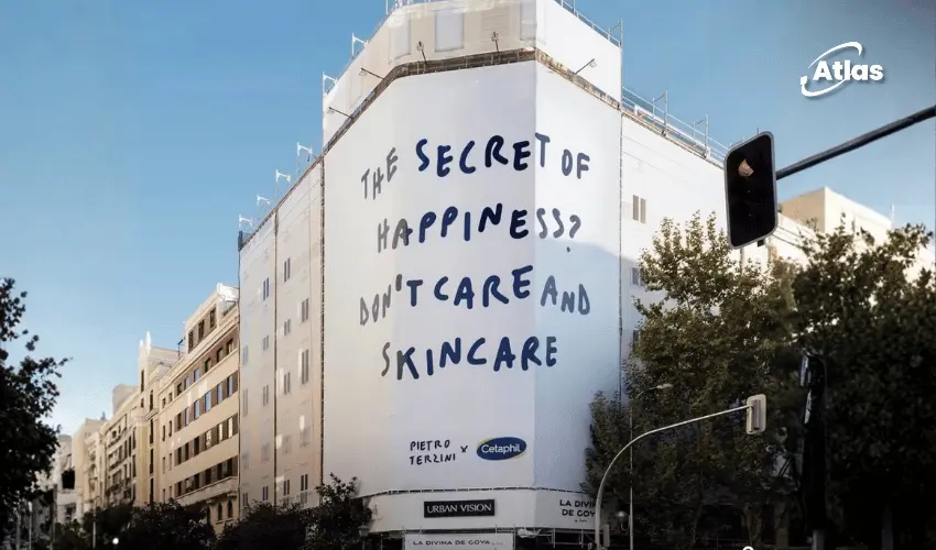
Against a pale background, Terzini’s casual handwritten style delivers the joke: “The Secret of Happiness? Don’t Care and Skincare.” It is short, conversational and connected to the brand category without turning into a traditional product claim. The language is the creative asset—and the sheer scale of the outdoor placement gives it presence.
Goya 111 in Madrid Turns Handwritten Wordplay Into Wallscape Advertising
One supplied photograph shows the sentence wrapped around a curved building corner in Madrid. The structure carries Urban Vision signage beneath the artwork. A representative of the outdoor media company identifies the site as Goya 111, in a prominent commercial area of the Spanish capital.
The execution is a strong example of Wallscape Advertising: the building facade becomes the canvas, while the message is large enough to read from across the intersection. Instead of filling the space with photography, the design uses very few elements—an off-white background, blue lettering and the Cetaphil x Pietro Terzini signature.
The format gives a handwritten phrase a public-art quality. A line that might appear in an artist’s notebook becomes a piece of Out-of-Home Advertising that pedestrians, drivers and nearby visitors can encounter as part of the city.
Why the Secret of Happiness Works as Creative OOH
The message is not a technical explanation of skincare. Its effect comes from wordplay, tone and timing. The well-known phrase “don’t care” is paired with “skincare,” producing a lighthearted contrast that invites viewers to read the line twice.
That is a useful distinction for Creative OOH. Outdoor audiences often have only moments to absorb an advertisement. A strong sentence can work when it is easy to process at a glance but still contains a twist that makes the idea stick.
Cetaphil also avoids a common skincare advertising convention: showing an idealized face as the main point of attention. The billboards instead emphasize language and personality. The brand is present, but the creative first asks the audience to respond to a thought.
From Limited-Edition Packaging to Giant Building Wrap Advertising
The outdoor execution connects to a wider Cetaphil x Pietro Terzini collaboration. According to Cetaphil’s official Italian website, the artist reinterpreted three core products through distinctive phrases and contemporary hand-lettering:
- Moisturizing Cream: “My Skin My Aura.”
- Gentle Skin Cleanser: “Sensitive Outside Invincible Inside.”
- Moisturizing Lotion: “The Secret of Happiness? Don’t Care and Skincare.”
Another supplied photograph captures a building-sized installation combining that same headline with images of the three Cetaphil products. The composition connects a witty public message with the limited-edition product designs while preserving the clean, recognizable style across both surfaces.
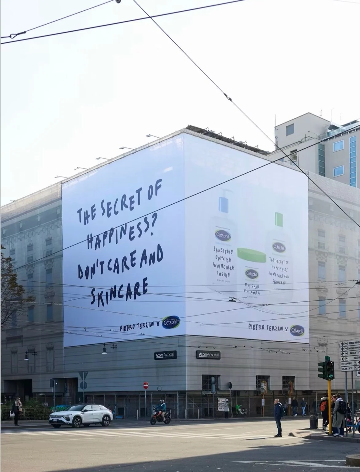
The Italian setting is evident from the streetscape and signage, but the exact address of this photographed wallscape has not been independently confirmed. Separate industry coverage reports that the Cetaphil collaboration is supported by large-format outdoor advertising in leading Italian and Spanish cities.
Minimalist Outdoor Advertising Can Be More Memorable Than a Crowded Visual
The two photographs show related ideas with different balances of information. The Madrid wallscape is almost entirely typographic. The other execution adds three Cetaphil products next to the message. Both use the same artistic language, so viewers can recognize the collaboration despite the change in layout.
For OOH Advertising, this is a reminder that minimalism is a strategic choice, not a lack of creativity. A large building wrap does not have to be visually dense. In fact, architecture-scale typography can become even more noticeable when the surrounding urban environment is crowded with signs, storefronts and traffic.
The artistic approach also aligns with Terzini’s wider work, which uses phrases and references to popular culture. In this case, the brand’s skincare category becomes part of the language itself, connecting the artist’s distinctive voice with Cetaphil’s identity.
Artist-Led Wallscapes Make Brand Identity Part of the City
Collaborations with artists can give Building Wrap Advertising more cultural texture. The commercial message is still visible, but the creative can resemble a public installation as much as a conventional advertisement. The audience is invited to engage with the sentence before being asked to think about a product.
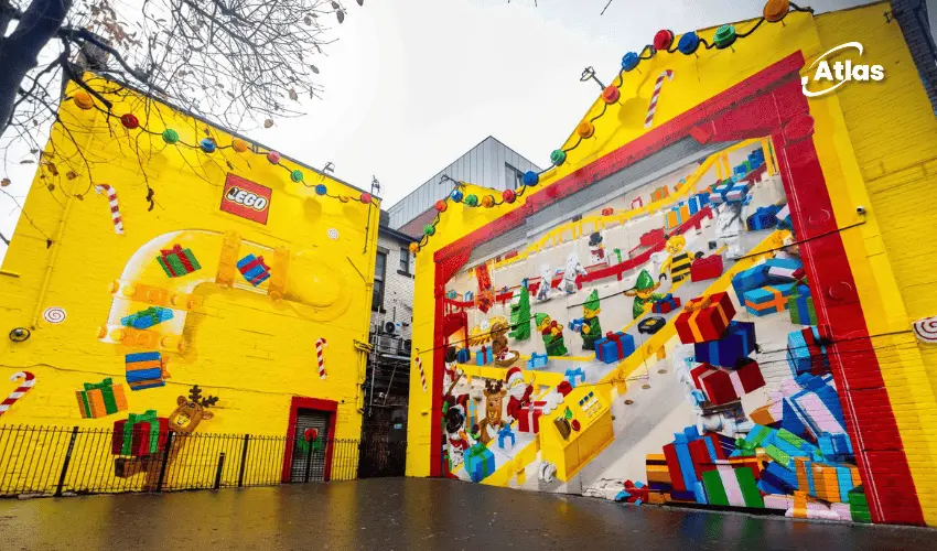
That principle is relevant to other brands exploring street-level creativity. Macy’s festive double-decker bus used three-dimensional characters to attract attention, while Nutella’s giant São Paulo toasters turned everyday infrastructure into a familiar product. Cetaphil works through another route: the unexpected power of a few words on a huge wall.
These are static photographed wallscapes, not verified Digital Out-of-Home screens or Programmatic DOOH inventory. No reliable impression, engagement or sales-lift figures were supplied, so the lesson is about the observable creative execution rather than a claim of proven performance.
Discover how Atlas OOH can give a sharp brand message the right urban canvas through high-impact building wraps, premium outdoor locations and creative media planning.
Frequently Asked Questions
What is the Cetaphil x Pietro Terzini OOH campaign?
It is a large-format outdoor extension of Cetaphil’s artist collaboration, with humorous handwritten messaging on building wraps and limited-edition product designs.
Where is the Cetaphil wallscape in Madrid?
One photographed installation is at Goya 111 in Madrid, as identified by a representative of the outdoor media company Urban Vision.
What is the secret of happiness line?
The central Cetaphil and Terzini phrase is “The Secret of Happiness? Don’t Care and Skincare,” using wordplay to link a lighthearted idea with the brand category.
Which Cetaphil products received limited-edition artwork?
Cetaphil’s Moisturizing Cream, Gentle Skin Cleanser and Moisturizing Lotion feature Terzini’s words and graphic style.
Are these digital billboards?
No. The supplied photographs show static printed building wraps and wallscape-style outdoor advertising.
Sources and Image Context
- Cetaphil Italy – Official Pietro Terzini limited-edition campaign and product messages
- Galderma – Official collaboration announcement
- Urban Vision representative – Location confirmation for Cetaphil at Goya 111, Madrid
- BeautyBiz – Cetaphil collaboration and Italian/Spanish large-format outdoor communication
- Two real-world installed wallscape photographs supplied by the user; one is reserved for the article cover and is not repeated inline.
Plan your OOH campaign
Get recommendations for markets, formats and availability based on your campaign goals.
Request a media plan



Comments
Share your take. Keep it constructive and specific.