
Untold Uses Painterly AI Imagery to Make Journaling Feel Human in OOH
AI is having an image problem.
For many consumers, the term now immediately suggests generic imagery, automation, replacement and a growing sense of creative fatigue.
That creates a difficult branding challenge for companies that actually use AI in ways designed to feel useful, personal or supportive.
Untold sits directly inside that tension.
The voice-first journaling platform uses AI to help people interpret spoken thoughts, identify emotional patterns and build a deeper understanding of themselves.
Its recent rebrand from The Working Assembly attempts to make that technology feel less artificial and more human.
Technology that starts with speaking
Untold is built around a simple behavioral shift.
Instead of asking users to type or handwrite a journal entry, the platform lets them speak.
It then uses those entries to surface emotional patterns, recurring themes and personalized reflections over time.
The product can also generate meditations and help users explore their experiences through psychological, philosophical, spiritual and artistic perspectives.
Why the old identity needed to change
The rebrand followed the launch of Perspectives, an expansion of Untold that introduced guided journaling flows, emotional trend mapping and the ability to ask questions based on everything a user had previously shared.
That expansion made the product broader than a simple voice-journaling tool.
The brand now needed to communicate understanding, reflection and personal growth.
The Working Assembly built the new strategy around three ideas:
- Speak freely.
- Feel understood.
- Grow intentionally.
Those principles became the foundation of the new visual and verbal system.
The visual identity deliberately avoids tech clichés
The most noticeable part of the rebrand is how little it looks like conventional AI branding.
There are no glowing neural networks.
No futuristic gradients.
No abstract chrome objects.
No robotic imagery.
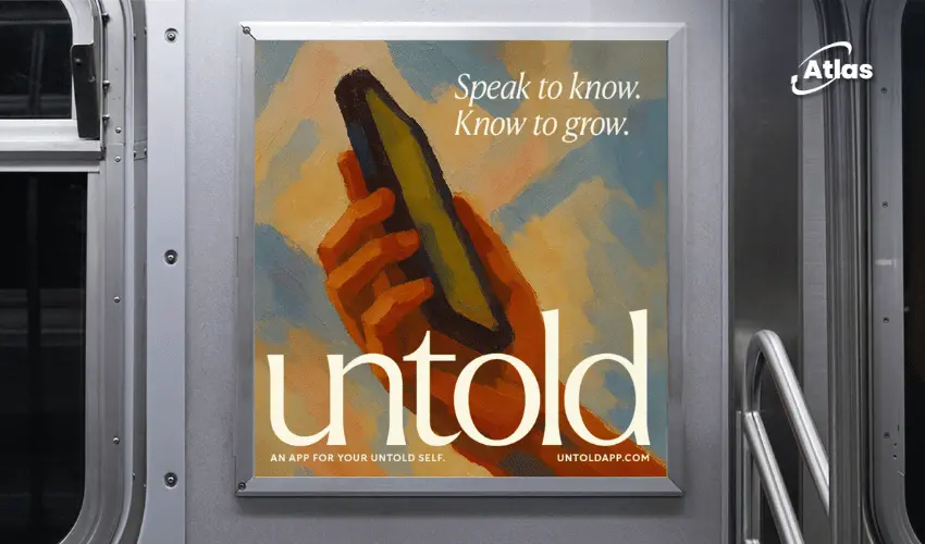
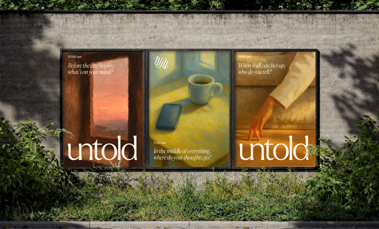
Instead, Untold uses painterly scenes built around hands, interiors, phones, furniture and moments of quiet reflection.
The AI illustration system is intentionally imperfect
At the center of the visual identity is a bespoke AI illustration system developed specifically for Untold.
The imagery uses visible brushwork, muted earth tones and small, intimate compositions.
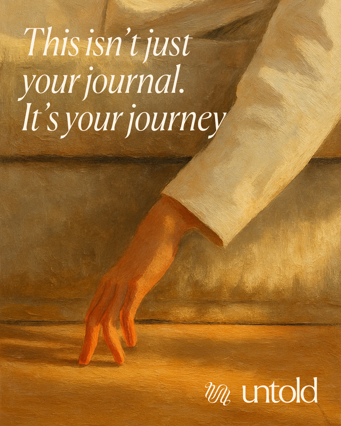
A hand reaches toward a sofa.
A phone sits on a table in afternoon light.
An empty room becomes part of the emotional story.
The system is designed to feel painterly rather than algorithmically slick.
Can AI-generated imagery really feel emotional?
That is where the work becomes more interesting.
The images are clearly trying to avoid the generic polish often associated with generative AI.
And visually, the system succeeds in creating something warmer, quieter and more coherent than many AI-led campaigns.
But the question of authorship still remains.
For some audiences, knowing the imagery is AI-generated may weaken the emotional authenticity the brand is trying to build.
For others, the method may matter far less than whether the visual system feels distinctive and useful.
OOH becomes the real test
What makes the identity especially interesting is how it behaves outdoors.
Small, introspective scenes are often designed for phones or editorial layouts.
Scaling them onto OOH can easily destroy the intimacy.
Untold avoids that by keeping the compositions simple.
A hand.
A phone.
A quiet environment.
A single line of copy.
The billboard becomes large without becoming loud.
“Speak to know. Know to grow.”
One transit execution uses the line:
“Speak to know. Know to grow.”
The copy efficiently explains the product journey without describing the technology behind it.
Speaking leads to understanding.
Understanding leads to growth.
That is much easier to process in OOH than a detailed explanation of emotional pattern recognition or AI analysis.
Why transit is a natural environment
Transit spaces can be surprisingly appropriate for journaling and reflection.
Commuters often spend time alone with their thoughts while moving through the city.
A quiet piece of creative in that environment can feel more relevant than it would in a highly promotional retail context.
The campaign meets people during moments when they may already be thinking, waiting or processing their day.
Painterly imagery creates contrast in the city
Urban advertising environments are full of sharp photography, saturated colors and polished digital imagery.
Untold’s softer visual system creates contrast precisely because it does not behave that way.
The muted palette and visible brushwork can make the creative feel almost editorial or cultural rather than overtly commercial.
That difference can help the brand attract attention without shouting.
The new wordmark supports the same idea
The lowercase Untold wordmark uses a serif style with enough looseness and personality to avoid feeling overly corporate.
The typography reinforces the sense of reflection and writing while still remaining clean enough for digital use.
The accompanying symbol uses an interlocking ribbon form that can suggest:
- A wave.
- A signature gesture.
- Two overlapping people.
- A continuous thought or conversation.
Its simplicity also allows it to work across app icons, OOH and social assets.
One system from billboard to app icon
One of the strongest achievements of the rebrand is consistency across scale.
The same visual language works on large outdoor posters and small mobile interfaces.
That is difficult because the two environments demand almost opposite behaviors.
OOH needs immediate simplicity.
Mobile UX needs detail and usability.
The painterly system bridges both by using the same emotional language rather than exactly repeating the same layouts.
Emotional data without dashboards
The mood-tracking screens are another interesting part of the system.
Emotional information could easily be presented as charts, bars or highly technical data visualization.
Untold instead represents mood levels through loose brushstrokes of color.
This makes the data feel less clinical.
The interface still communicates information, but it does so in a way that matches the rest of the brand.
AI is hidden behind the benefit
Perhaps the most important strategic decision is that the brand does not lead with AI.
The technology exists underneath the experience.
The communication leads with voice, understanding and growth.
That is particularly relevant at a moment when AI itself can create resistance.
The campaign does not ask audiences to become excited about machine intelligence.
It asks them to become interested in understanding themselves.
Frequently asked questions
What is Untold?
Untold is a voice-first journaling platform designed to turn spoken thoughts into patterns, emotional insights, guided reflections and personalized growth tools.
Who created Untold's new identity?
The rebrand was developed by New York branding and creative agency The Working Assembly.
How does AI appear in the new visual system?
The identity includes a bespoke AI illustration system trained specifically for Untold, using painterly imagery, muted tones and intimate compositions.
How does the campaign work in OOH?
The outdoor creative scales intimate painterly scenes onto large-format media while keeping the copy minimal, helping the brand feel reflective and emotionally human rather than overly technical.
Sources
- Strategic rebrand positions Untold as emotionally resonant AI - https://www.transformmagazine.net/articles/2026/strategic-rebrand-positions-untold-as-emotionally-resonant-ai/?utm_source=chatgpt.com (2026-06-24)
Plan your OOH campaign
Get recommendations for markets, formats and availability based on your campaign goals.
Request a media plan
Comments
Share your take. Keep it constructive and specific.