
Uber Turns Germany’s Everyday Travel Frustrations Into a Playful OOH Campaign
Some mobility campaigns focus on speed, technology or price.
Uber’s latest German brand platform starts somewhere much more relatable:
The small frustrations of getting from one place to another.
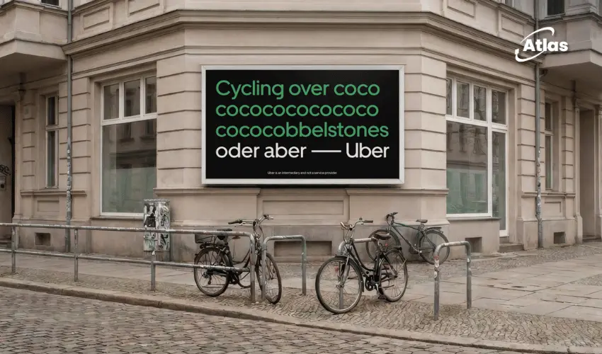
Created with Serviceplan, the campaign uses the recurring line “oder aber Uber” — roughly, “or rather Uber” — to contrast inconvenient everyday travel moments with the possibility of taking an Uber instead.
The platform launched across Germany in May 2026 and gives the brand a simple creative device that can adapt easily to different situations, locations and OOH formats.
A simple line that creates a repeatable platform
The strength of “oder aber Uber” is its flexibility.
The phrase can follow almost any transportation frustration.
A difficult route.
An uncomfortable ride.
Bad weather.
Heavy luggage.
Or, in one particularly playful execution, the vibrations of travelling over cobblestones.

Making a bumpy ride visible through typography
One billboard uses text itself to simulate the experience of moving across an uneven road.
The copy stretches into a repeated sequence such as “cococococococo...”, creating the impression that the speaker or typist is physically being shaken while moving across cobblestones.
The visual joke works because audiences can almost feel the journey through the typography.
Then comes the resolution:
oder aber Uber.
The message does not need to explicitly say that Uber offers a smoother alternative.
The contrast has already communicated it.
Why this works especially well in OOH
Outdoor advertising rewards ideas that can be understood quickly.
The Uber execution does not rely on a long explanation of product features.
Instead, it establishes a familiar problem and resolves it with a short branded punchline.
- The problem is recognizable immediately.
- The visual mechanic creates humor.
- The copy remains short enough for outdoor viewing.
- The Uber name becomes the solution.
This structure is particularly effective for roadside and urban media where audiences may only have a few seconds to process the message.
The city becomes part of the joke
Mobility advertising has a natural advantage in OOH because the audience is already travelling when they encounter it.
A billboard about an uncomfortable journey becomes more relevant when viewed from within the transportation environment itself.
If the placement is near a cobbled street, busy interchange or difficult route, the surrounding city can reinforce the creative idea.
Turning friction into positioning
Uber is not necessarily claiming that every alternative mode of transportation is bad.
The campaign is instead identifying moments when another option may feel inconvenient.
This is strategically useful because mobility decisions are highly contextual.
People may walk one day, take public transportation another day and choose a car when circumstances change.
“Oder aber Uber” positions the service as the option consumers can consider when the original plan becomes inconvenient.
Humor lowers the promotional pressure
Direct comparative advertising can easily become aggressive.
This campaign avoids that tone by making the inconvenience itself the joke.
The audience recognizes the situation first and the product message second.
That makes the campaign feel more observational than promotional.
Uber becomes the punchline rather than a long list of reasons to download the app.
Typography becomes motion without a screen
The repeated letters are also a useful example of creating perceived movement within static media.
No animation is necessary.
The distorted rhythm of the copy allows the audience to imagine the vibration.
This gives the billboard energy while remaining completely static.
A platform built for multiple urban frustrations
The phrase “oder aber Uber” gives the campaign room to respond to many different situations.
Future executions could potentially play with:
- Unexpected rain.
- Missed connections.
- Heavy shopping bags.
- Late-night journeys.
- Long walks between destinations.
- Uncomfortable road surfaces.
The circumstances can change while the final branded structure remains familiar.
That repetition helps build recognition over time.
Why consistency matters for a national rollout
A campaign running across Germany needs enough flexibility to feel locally relevant without becoming visually fragmented.
The recurring line solves that problem.
Different cities can feature different travel observations, while audiences continue to recognize the same Uber platform.
This allows local context and national consistency to coexist.
The product benefit is implied, not explained
One of the most effective aspects of the campaign is what it leaves unsaid.
The billboard does not need to list comfort, convenience or app functionality.
The audience already understands the contrast.
That restraint is valuable in OOH.
Rather than spending precious viewing time explaining the service, the creative lets the consumer complete the argument themselves.
Plan your OOH campaign
Get recommendations for markets, formats and availability based on your campaign goals.
Request a media plan
Comments
Share your take. Keep it constructive and specific.