
Tinder’s First Rebrand in Nearly a Decade Feels Surprisingly Familiar
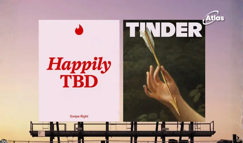
Tinder has introduced its first major rebrand in nearly a decade, giving the dating platform a broader visual system and a new strategic idea built around “Happily TBD.”
The work is not poorly designed. It is polished, considered and clearly created to operate across a wide variety of cultural, social and advertising environments.
Yet the identity also creates an immediate feeling of familiarity.
Oversized editorial serifs, bold color blocking, glossy three-dimensional icons, internet humor, high-and-low cultural imagery and self-aware out-of-home copy have all become common features of contemporary lifestyle branding.
Individually, none of these elements are a problem. Together, however, they make Tinder’s new identity feel less like the beginning of a new visual language and more like a summary of the previous decade’s most recognizable design trends.

A polished identity built from familiar ingredients
The new system appears deliberately eclectic. It reflects the idea that younger audiences cannot be represented by one visual style, personality or definition of a successful relationship.
This gives Tinder significant creative flexibility. The brand can move between refined editorial compositions, playful internet imagery, colorful product graphics and witty campaign copy without being limited to one rigid aesthetic.
That flexibility is useful for a global platform responding to rapidly changing conversations around dating and relationships.
But eclecticism does not automatically create distinctiveness.
The visual language of modern lifestyle brands
The identity contains visual echoes of many influential brands and publications from fashion, beauty, technology and internet culture.
Large serif typography recalls the editorial confidence used by fashion publications and direct-to-consumer beauty brands. Bright color fields and playful graphics resemble the flexible campaign systems used by music and technology platforms.
Glossy, jelly-like 3D icons belong to a broader visual trend that has appeared across beauty, social media and youth-oriented consumer brands. Meanwhile, knowing copy and meme logic have become standard tools for companies trying to demonstrate fluency in online culture.
This does not mean Tinder is copying any one brand. The issue is cumulative. When so many familiar references appear in the same system, the identity risks feeling assembled from existing cultural signals instead of creating its own.
Why expectations are higher for Tinder
Tinder is not simply another consumer technology brand. The platform fundamentally changed the visual and behavioral language of online dating.
The swipe mechanic became globally recognizable, while the phrase “swipe right” moved beyond the app and became part of everyday culture.
Because Tinder previously introduced such a powerful interaction and cultural idea, expectations for its first rebrand in almost ten years are naturally high.
A brand with that level of influence has an opportunity to show audiences what the next generation of dating could look and feel like.
Instead, the new identity often feels connected to the visual language that dominated branding between the late 2010s and early 2020s.

Timeless or already dated?
There is an important difference between a design feeling timeless and simply feeling familiar.
Timeless identities remain useful because they are built around recognizable principles that survive changing visual fashions. Trend-driven identities can feel relevant immediately, but they may lose impact once those trends become oversaturated.
Tinder’s new system attempts to create longevity through flexibility. It can absorb different styles, images, jokes and cultural references as audiences and conversations change.
However, many of the system’s foundational elements are closely associated with an existing era of design. That creates the risk that the identity may already feel dated, despite being newly released.
Where the strategy feels stronger
Although the visual identity may divide opinion, the strategic thinking contains several strong ideas.
Giving Tinder the voice of a modern dating columnist is a smart direction. It allows the brand to comment on dating behavior with humor, experience and cultural awareness rather than speaking like a conventional technology platform.
The “Happily TBD” platform is also a meaningful evolution of traditional dating language.
Dating brands have historically focused on helping people find “the one.” Happily TBD replaces that fixed destination with something more open-ended. It recognizes that relationships can develop in different ways and that users may not always know exactly what they are looking for.
This gives Tinder a more flexible and realistic position within contemporary dating culture.
The opportunity for OOH
The new verbal identity has strong potential for out-of-home advertising.
Short observations about dating, uncertainty and modern relationships can work effectively on billboards, transit placements and digital screens. Audiences can understand a witty dating insight quickly, even when they encounter it while moving through a city.
OOH can also make the platform’s voice feel culturally present. Instead of limiting conversations to the app, Tinder can place familiar dating experiences within public environments where people meet, socialize and move between real-world relationships.
- Billboards can build cultural scale: Short, confident statements can make Tinder feel part of a wider social conversation.
- Transit can add contextual relevance: Dating messages can appear during journeys to nightlife, entertainment and social districts.
- DOOH can respond to different moments: Campaign copy can change by location, time, weather or cultural event.
- Street-level formats can encourage sharing: Relatable observations can become content audiences photograph and repost.
The challenge will be ensuring that the copy and visual treatment are immediately identifiable as Tinder rather than simply looking like another culturally aware lifestyle campaign.
Good design is not always distinctive design
Tinder’s new identity demonstrates that technical quality and originality are not the same thing.
The system is competently executed. It offers flexibility, reflects the complexity of its audience and creates a useful foundation for campaigns across social media, outdoor advertising and digital products.
But strategically interesting work can still feel visually predictable.
For a smaller or less culturally significant company, the identity might feel fresh and ambitious. For Tinder, a platform that once transformed how people communicate about dating, the result feels surprisingly safe.
Bottom line
Tinder’s rebrand is colorful, polished and capable of producing engaging campaigns. The Happily TBD platform gives the brand a strong strategic idea, while its new voice creates clear opportunities for witty and culturally relevant OOH.
However, the visual system relies heavily on design conventions that audiences have already encountered across fashion, beauty, music, technology and dating brands.
The result is good design, but not necessarily distinctive design.
For a company that helped define the previous decade of dating, the bigger question is whether this identity will shape the next one or simply reflect the branding trends that came before it.
Comments
Share your take. Keep it constructive and specific.