
Quick answer: The best DOOH isn’t “scroll-stopping.” It’s route-stopping—built for motion, repetition, and instant recognition. Below are 12 creative formats that consistently win attention in public space.
Why most DOOH fails (and it’s not the media)
Most DOOH underperforms for one simple reason: it’s designed like digital. Public space doesn’t behave like a feed. People don’t “browse” billboards—they encounter them while commuting, shopping, waiting, or moving through a city.
Your objective isn’t clicks. It’s:
- Recognition in under 2 seconds
- Reinforcement through repetition
- A reason to look twice (because the idea is instantly clear—and slightly surprising)
12 DOOH formats that reliably win attention
1) Ultra-simple headline + one visual (the “two-second read”)
One idea. One image. One line you can understand at speed. If it needs a second sentence, it’s already too late.
2) Context copy (place/time/weather/route)
Mention the reality people are in: the neighborhood, the commute, the temperature, the day. Context is an attention shortcut.
3) Dynamic dayparting (morning vs evening swaps)
Same screen, different mindset. Match creative to the time window when the behavior actually happens.
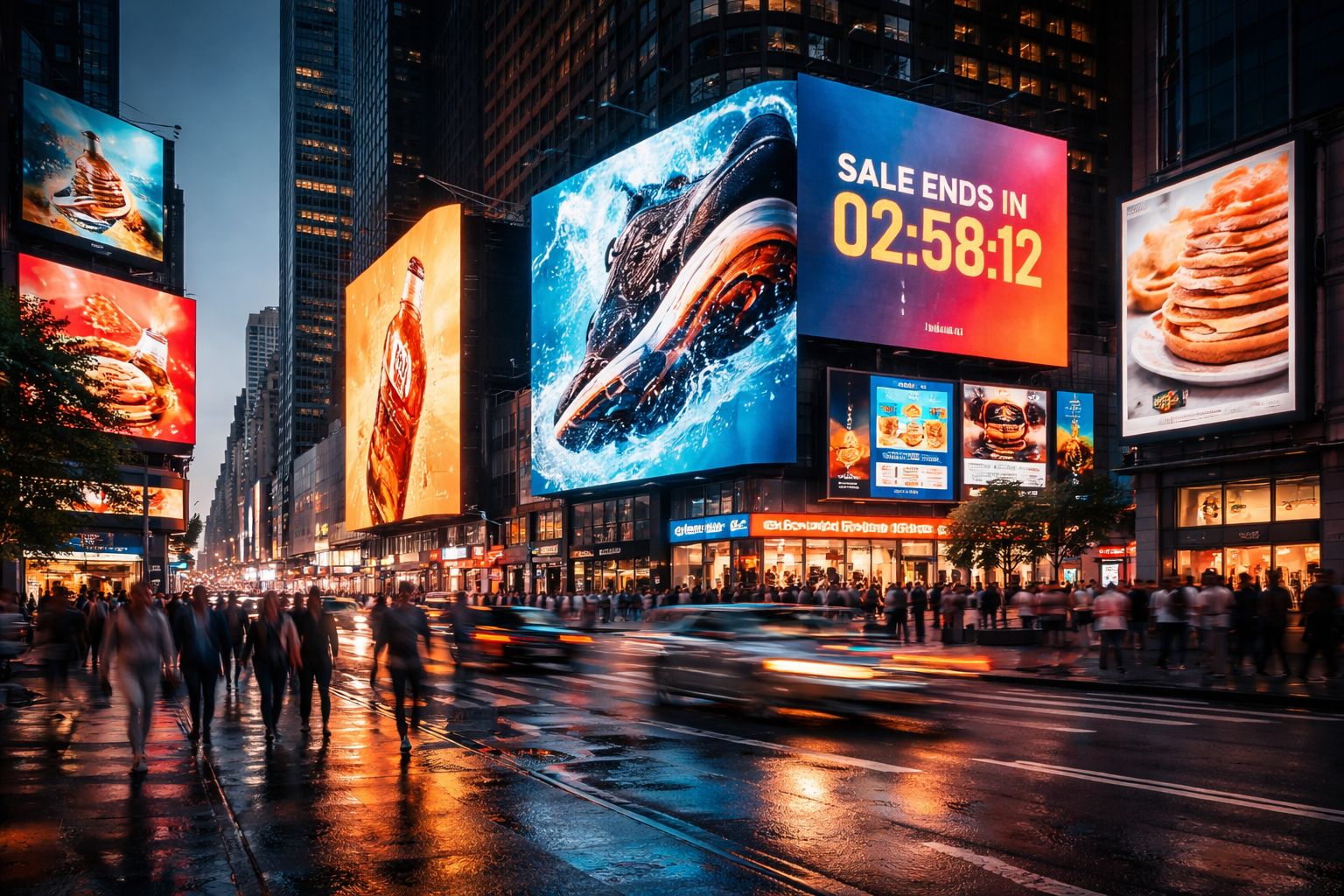
4) Countdowns / urgency timers
Launch windows, drops, ticket deadlines—countdowns turn passive viewing into “I should act soon.”
5) Sequential storytelling (chapters across units)
Use multiple screens or boards as a series. People don’t need the whole story—just enough to trigger curiosity and memory.
6) Roadblocks (corridor dominance)
Repetition in minutes creates a powerful perception: the brand feels “everywhere,” which improves recall fast.
7) Anamorphic / forced perspective
Built for phone capture and social sharing. When the illusion is clean, the audience does the distribution for you.
8) Lenticular / motion illusion
Movement without video. A classic trick that still works because it’s unexpected in public space.
9) Live data triggers
Scores, wait times, price drops, air quality—when the data is relevant, it becomes the hook that earns attention.
10) “Proof” creative (reviews, ratings, real receipts)
Trust travels faster than claims. Use recognizable proof points that reduce skepticism instantly.
11) Product-as-hero (oversized object, minimal words)
When the product is iconic, make it the whole ad. Big object, clean background, a single message.
12) Public participation (only when stopping is realistic)
Polls, prompts, interactions—works best in dwell environments. The key is making participation feel natural, not forced.
How to choose the right format
Pick formats based on the job the media needs to do—not what looks cool in a deck:
- Launch / awareness: roadblocks, anamorphic, oversized product
- Consideration: proof creative, sequential storytelling
- Performance: context copy, live data, dayparting
The DOOH brief that gets better work
Don’t brief “make it bold.” Brief:
- What someone should remember after one glance
- Where it lives (route, dwell, speed, clutter level)
- What the creative must do at speed (recognition first, clever second)
Comments
Share your take. Keep it constructive and specific.