
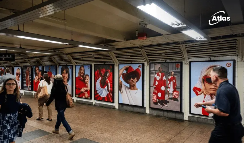
Target Turns Grand Central Red With a Bullseye-Filled OOH Takeover
Some brands need a headline to be recognized.
Target can often do it with a color and a circle.
At Grand Central, the retailer is leaning into exactly that advantage with an OOH takeover built around head-to-toe red and a heavy concentration of its iconic bullseye.
The result is less like a conventional ad placement and more like a temporary re-skinning of the environment.
When brand assets become the campaign
Target has one of the most recognizable visual identities in retail.
Its red color palette and bullseye mark have been repeated consistently enough that they can communicate the brand with very little additional explanation.
That makes them especially valuable in OOH.

Why Grand Central is the right canvas
Grand Central is already a highly recognizable and visually structured environment.
That gives a brand takeover immediate contrast.
Commuters know what the station normally looks like.
When familiar surfaces suddenly turn Target red, the change is noticeable even before the audience understands the campaign in detail.
This makes environmental transformation itself part of the media idea.
Head-to-toe branding creates ownership
The strength of the execution comes from repetition.
One logo would identify the advertiser.
Dozens of bullseyes and large areas of red do something different:
They make the space feel temporarily owned by the brand.
- Red creates immediate recognition.
- Bullseyes reinforce attribution.
- Repetition creates visual dominance.
- The transit setting provides constant audience flow.
The environment becomes part of the creative
This type of campaign works because the media is not treated as a collection of isolated panels.
Instead, the station environment becomes one connected canvas.
Walls, passageways and repeated surfaces can all contribute to the same visual system.
That creates a stronger sense of immersion than a single billboard could achieve.
Why Target does not need complicated copy
The visual identity carries much of the communication.
That allows the campaign to remain simple.
In a busy transit environment, this is an advantage.
People are walking, navigating and moving quickly.
A complicated message can easily disappear.
A wall of red and bullseyes does not require explanation.
Color becomes media
Target red is doing more than decorating the space.
It functions almost like a media unit itself.
The more consistently the color appears across the environment, the more difficult it becomes to separate the physical space from the brand.
This is a useful reminder that color can be one of the most efficient assets in large-scale OOH.
Why repeated logos do not feel redundant here
In many campaigns, repeating the logo too often can feel heavy-handed.
Here, repetition is the idea.
The bullseye already has a graphic simplicity that makes it suitable for patterning, clustering and large-scale repetition.
Instead of behaving like a conventional logo lockup, it becomes part of the environmental design.

Transit gives the campaign frequency
Grand Central also provides one of OOH's strongest benefits: repeated exposure.
Regular commuters may encounter the same takeover multiple times during the campaign period.
That repetition compounds recognition.
The environment becomes familiar, and Target's presence becomes embedded into the daily journey.
From awareness to mental availability
Most people passing through Grand Central are not necessarily shopping at that exact moment.
That does not reduce the value of the media.
Retail brands benefit heavily from mental availability.
The campaign can make Target easier to recall later when a consumer needs groceries, household products, clothing or another everyday purchase.
OOH helps create that memory before purchase intent exists.
Plan your OOH campaign
Get recommendations for markets, formats and availability based on your campaign goals.
Request a media plan
Comments
Share your take. Keep it constructive and specific.