
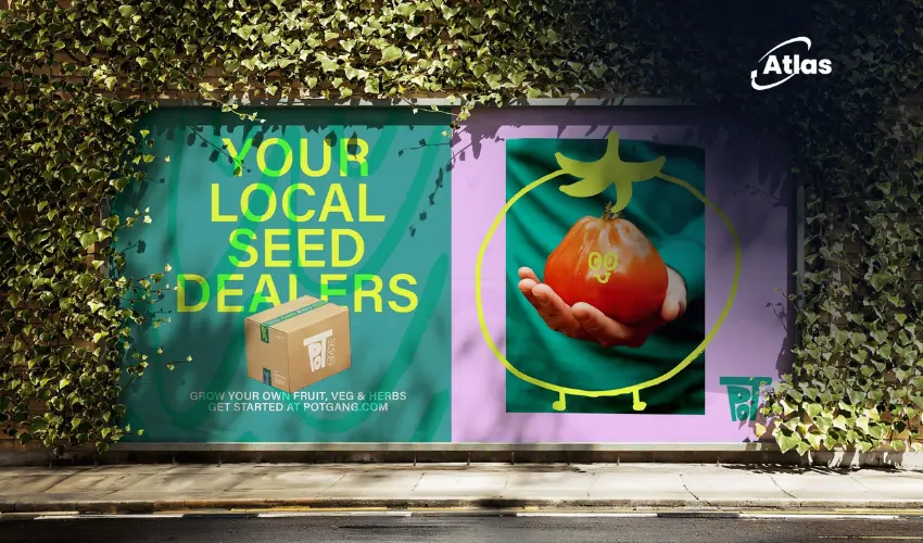
Pot Gang Rebrands With Customers as Creative Team
Branding projects often begin with strategy decks, trend reports, and moodboards. But for Pot Gang, the process started somewhere more personal: its own community. Working alongside creative studio Land of Plenty, the gardening subscription brand embraced customer participation as a central part of its visual transformation.
The result is a playful, character-filled identity that reflects how modern audiences engage with gardening today — less formal hobby, more lifestyle and self-expression. Instead of presenting gardening as intimidating or overly polished, the rebrand leans into humor, creativity, and personality.
Designing with the audience, not just for them
One of the most interesting parts of the project is how customers became part of the creative direction itself. Rather than treating the audience as passive consumers, the rebrand treated them as collaborators.
This approach helped shape everything from illustration styles and typography to tone of voice and brand behavior. The visual system feels intentionally imperfect, colorful, and human — reflecting the unpredictable nature of both plants and people.
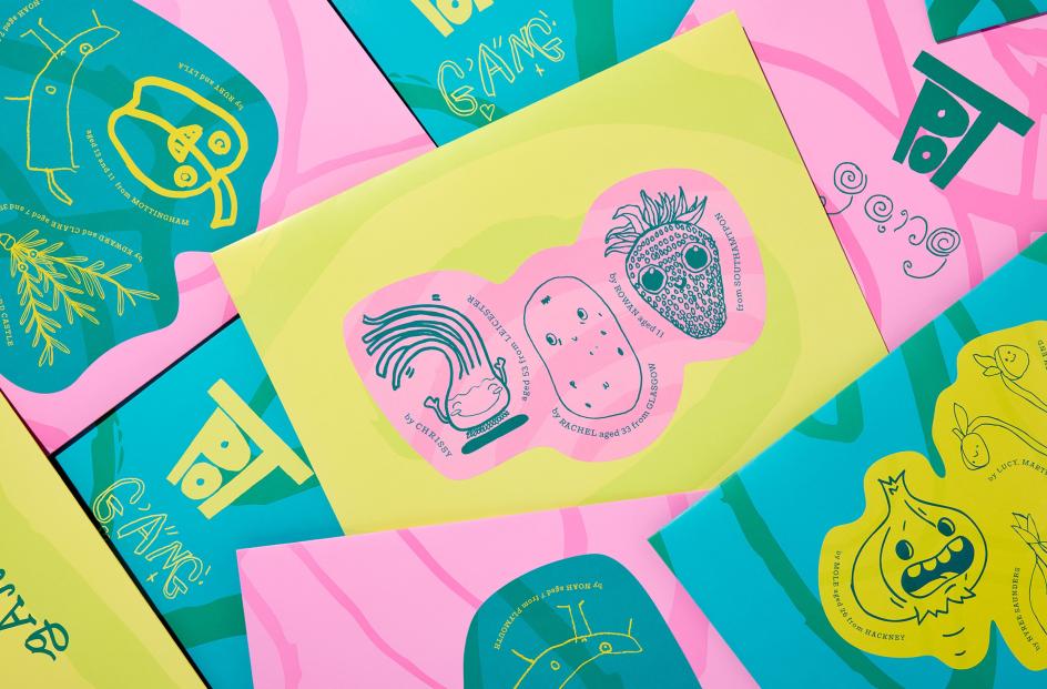
For modern brands, this strategy matters because audiences increasingly expect participation. Community is no longer just something brands build after launch; it becomes part of the identity from the beginning.
A softer, more emotional gardening aesthetic
Traditional gardening brands often rely on earthy minimalism or premium botanical aesthetics. Pot Gang moved in a different direction. The new identity embraces bold graphics, playful illustrations, and a more approachable personality.
Instead of positioning gardening as expertise-driven, the brand frames it as experimentation, discovery, and fun. That shift helps the company feel more accessible to younger audiences who may be entering the category for the first time.
Why community-driven branding is growing
The Pot Gang project reflects a larger movement happening across branding and marketing. Consumers increasingly want to feel seen inside the brands they support. This is especially true for lifestyle categories where emotional connection matters as much as the product itself.
Community-driven branding helps companies build stronger engagement because audiences recognize their own culture, humor, and values inside the creative system. In digital environments crowded with polished visuals, authenticity often becomes more memorable than perfection.
That idea also translates into physical spaces and campaigns. Whether through packaging, murals, retail activations, or OOH campaigns, brands that feel community-built tend to generate stronger emotional recall.
What marketers can learn from Pot Gang
- Audience participation creates stronger identity systems: Customers can help shape tone, visuals, and storytelling.
- Personality matters more than category conventions: Brands do not always need to follow traditional aesthetics.
- Imperfect visuals can feel more human: Playfulness and spontaneity often create stronger emotional connection.
- Community is now part of branding strategy: It is no longer just a social media tactic.
Bottom line
Pot Gang’s rebrand shows how identity design can become more collaborative, emotional, and community-centered. By allowing customers to influence the creative process, Land of Plenty helped transform the brand into something more relatable and culturally alive.
As brands compete for attention in increasingly crowded markets, the projects that resonate most may not be the ones with the most polished visuals, but the ones that genuinely reflect the people they are built for.
Comments
Share your take. Keep it constructive and specific.