
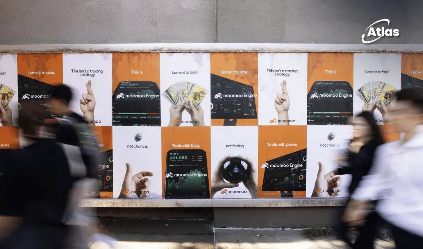
Moomoo Turns New York Bright Orange With a High-Impact OOH Push
Financial advertising does not always need to look conservative.
Moomoo is proving that point across New York City with an OOH campaign designed to be visually difficult to ignore.
The global investment and trading platform has taken its signature bright orange into Manhattan through street-level wildpostings and a large multi-sign domination near the Holland Tunnel entrance.
The campaign introduces the new Moomoo Engine, a suite of tools designed to help investors move from discovering an idea to making a trade.
Making financial technology visible in the real world
Investment platforms are primarily digital products.
People research, analyze and trade through screens.
OOH gives that digital service a physical presence.
By occupying real-world media across New York, Moomoo can make the platform feel larger, more established and more culturally present beyond the app itself.

The Moomoo Engine gives the campaign a clear product story
The creative focuses on the Moomoo Engine, positioning it as a set of tools that supports the full investing journey.
The proposition is not only about executing trades.
It is about helping users move through several stages:
- Find an investment idea.
- Explore and analyze it.
- Make a decision.
- Execute the trade.
This gives the brand a broader story than simply being another trading app.
Why orange matters
The campaign is wrapped in Moomoo’s signature bright orange.
That choice does more than make the creative colorful.
It creates a distinctive visual asset that can connect very different OOH formats.
A wildposting on a Manhattan wall and a large tunnel-side sign may have completely different dimensions, but the same orange treatment makes them feel like part of one campaign system.
Wildpostings create street-level frequency
The Manhattan wildpostings bring the campaign down to pedestrian level.
This format is particularly effective in dense urban environments because it can create repetition across neighborhoods without requiring every placement to be individually enormous.
- Repeated posters build familiarity.
- Street-level placement reaches pedestrians directly.
- Clusters create stronger visual dominance.
- The format gives the brand an energetic, urban feel.
For a platform trying to stand apart from traditional financial communication, that street presence can help make the brand feel more contemporary.
The Holland Tunnel delivers a different kind of impact
The multi-sign domination near the Holland Tunnel entrance performs a different role.
Rather than building frequency through many smaller units, it creates concentrated scale.
The location reaches vehicle traffic moving through one of Manhattan’s major gateways and gives Moomoo a highly visible presence close to SoHo.
Multiple signs working together can also create a stronger sense of ownership than one isolated billboard.

Why a multi-sign domination works
A domination strategy allows several adjacent surfaces to function as one larger media experience.
The creative can repeat, sequence or divide messages across multiple panels.
That makes the physical location itself feel more heavily branded.
For Moomoo, the orange identity can visually connect those individual signs and create the impression that the brand has temporarily taken ownership of the corridor.
SoHo gives the campaign cultural context
The location near SoHo also matters.
The area combines retail, fashion, technology, tourism and professional audiences.
That creates a useful context for a financial technology brand that wants to appear modern rather than institutional.
The campaign becomes part of a broader urban environment associated with new products, design and cultural visibility.
Timing around a high-energy New York period
The campaign was strategically timed around a period of increased activity and foot traffic in New York following the 2026 FIFA World Cup.
Large cultural and sporting events can temporarily increase movement, tourism and public attention across major cities.
For advertisers, that creates an opportunity to capture audiences while the city itself is operating at a higher level of energy.
Moomoo’s bold visual language fits naturally into that environment.
The campaign leads into a physical retail expansion
The OOH campaign also supports a larger marketing push ahead of Moomoo’s planned first U.S. retail store in Midtown Manhattan.
That gives the outdoor work another strategic role.
It is not simply introducing a feature.
It is preparing the market for a deeper physical presence.
From trading app to physical brand
A retail store changes the relationship people can have with a fintech platform.
The brand moves from something encountered primarily through a phone to something with a real address.
OOH helps prepare that transition.
The audience first sees Moomoo across the city.
Then the brand arrives physically in Midtown.
This creates a useful sequence:
Digital product → public visibility → physical destination.
Why visibility matters in a crowded finance category
Investing and trading platforms compete in a category where many services offer similar functional promises.
Low fees, analytics, market access and investment tools can quickly become difficult to differentiate through product claims alone.
Distinctive branding becomes more important.
The bright orange, playful name and high-impact media strategy give Moomoo a visual territory that can be recognized even when audiences are not actively comparing investment platforms.

Plan your OOH campaign
Get recommendations for markets, formats and availability based on your campaign goals.
Request a media plan
Comments
Share your take. Keep it constructive and specific.