
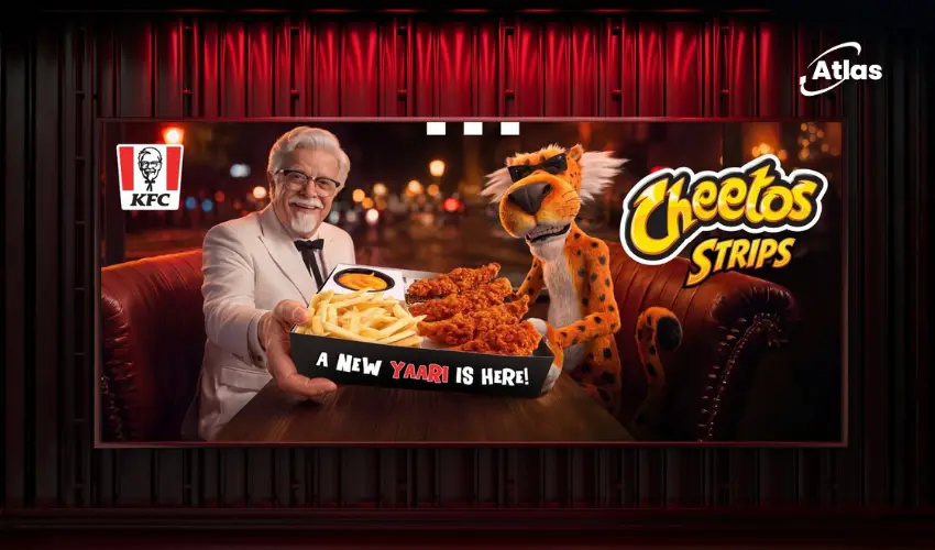
KFC x Cheetos Builds a Bold Visual World From Packaging to OOH
Some collaborations work because the brands complement one another quietly.
KFC x Cheetos was never going to be one of those.
Both brands arrive with loud, distinctive personalities, recognizable colors and products built around indulgence, texture and strong flavour.
The creative challenge was therefore not to tone either identity down.
It was to build a visual world capable of holding both at the same time.
Two iconic brands, one visual system
A successful brand collaboration needs to feel more intentional than placing two logos beside one another.
The audience should immediately understand that the partnership has created something new.
For KFC x Cheetos, the campaign developed a visual language that combines the familiar assets of both brands while amplifying their shared sense of energy.

Designing around flavour intensity
The collaboration naturally lends itself to bold creative.
KFC brings crispy fried chicken, recognizable red-and-white branding and a strong product photography language.
Cheetos brings vivid orange, exaggerated texture and a playful visual personality.
Together, those assets create a campaign world where intensity is an advantage rather than something that needs to be restrained.
The creative can visually communicate crunch, seasoning and indulgence before audiences ever taste the product.
Packaging as the starting point
For food collaborations, packaging is not simply a functional container.
It is one of the campaign’s most important media surfaces.
The KFC x Cheetos visual identity was developed across packaging, creating a tangible version of the partnership that consumers could physically hold.
This creates an important foundation for the wider campaign because the packaging becomes the visual reference audiences later encounter across other media.
- Packaging introduces the collaborative identity.
- OOH enlarges it into public space.
- Retail and restaurant environments reinforce recognition.
- Social content keeps the same visual world circulating.

Why large-scale OOH is a natural fit
Some creative systems become more effective as they get larger.
KFC x Cheetos is one of them.
Large-format OOH gives product photography, texture and color enough scale to become almost physical.
A close-up of fried chicken covered in Cheetos-inspired seasoning can dominate an urban advertising surface in a way that makes the product difficult to ignore.
Color becomes immediate recognition
Cheetos owns one of the most distinctive color territories in packaged snacks.
Its intense orange can become an immediate memory cue even before audiences register the logo.
KFC’s red adds another highly recognizable layer.
The combination creates a visual system with enough contrast and saturation to stand apart from surrounding city environments.
This is particularly useful in OOH, where audiences often process color before they have time to read copy.
OOH should look like the packaging exploded
One of the strongest approaches for a campaign like this is to avoid creating a separate advertising identity.
The billboard should feel like the product world has simply expanded.
Packaging details, textures, colors and product photography can move directly into large-format layouts.
This creates a clear path from awareness to purchase.
- Consumers see the campaign outdoors.
- They recognize the same visual identity in-store or at KFC.
- The packaging confirms the product they previously encountered.
- The campaign and purchase experience reinforce one another.
Keeping both brands recognizable
Brand collaborations often fail when one identity overwhelms the other.
That risk is particularly relevant when both partners already have strong visual equity.
The KFC x Cheetos campaign needs enough KFC to remain recognizable as a restaurant product and enough Cheetos to make the collaboration feel genuinely different from a standard menu launch.
This balance can be achieved through:
- Shared color hierarchy.
- Recognizable product photography.
- Clear logo relationships.
- Consistent packaging cues.
- A tone that feels energetic and playful.

Texture is part of the communication
This is a collaboration where texture carries meaning.
The audience should almost be able to imagine the crunch from the image.
Close-up product photography, crumbs, coating and exaggerated food detail can therefore perform more than a decorative role.
They communicate the sensory promise of the collaboration.
A campaign built for visual impact
KFC and Cheetos are both brands comfortable with bold communication.
That gives the campaign permission to avoid subtlety.
Large typography, saturated colors, oversized product imagery and energetic compositions can all feel appropriate because they align with the personalities audiences already associate with the brands.
The result is a campaign that can behave more like a visual event than a conventional product announcement.
Why collaborations need more than novelty
The initial appeal of KFC x Cheetos comes from the unexpected combination of two familiar brands.
But novelty alone has a short lifespan.
A strong visual system helps extend that excitement by giving the partnership its own recognizable identity.
Consumers can begin to identify the collaboration through its colors and imagery even after the surprise of the announcement fades.
This is where design becomes strategically important.
Plan your OOH campaign
Get recommendations for markets, formats and availability based on your campaign goals.
Request a media plan
Comments
Share your take. Keep it constructive and specific.