
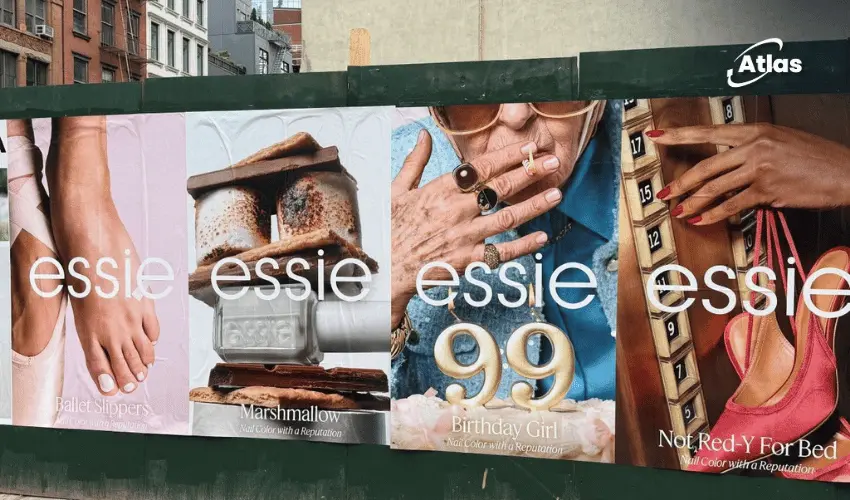
Essie Turns Back-to-School Season Into a Cheeky Luxury Brand Moment
Back to school.
Back to work.
Back to a fresh coat of Essie.
For millions of people, a manicure is part of the seasonal reset.
It is small, visible and personal — exactly the kind of ritual that explains why Essie has remained culturally relevant for so long.
Now the brand is using that familiarity as the foundation for a broader evolution.
A rebrand built around elevation, not reinvention
Essie has introduced a new positioning:
“Elevated nail beauty with a twist.”
The language signals a shift toward more premium beauty territory, but it does not suggest abandoning the personality that made the brand distinctive.
That balance is critical.
Cheeky Luxury explains the tension
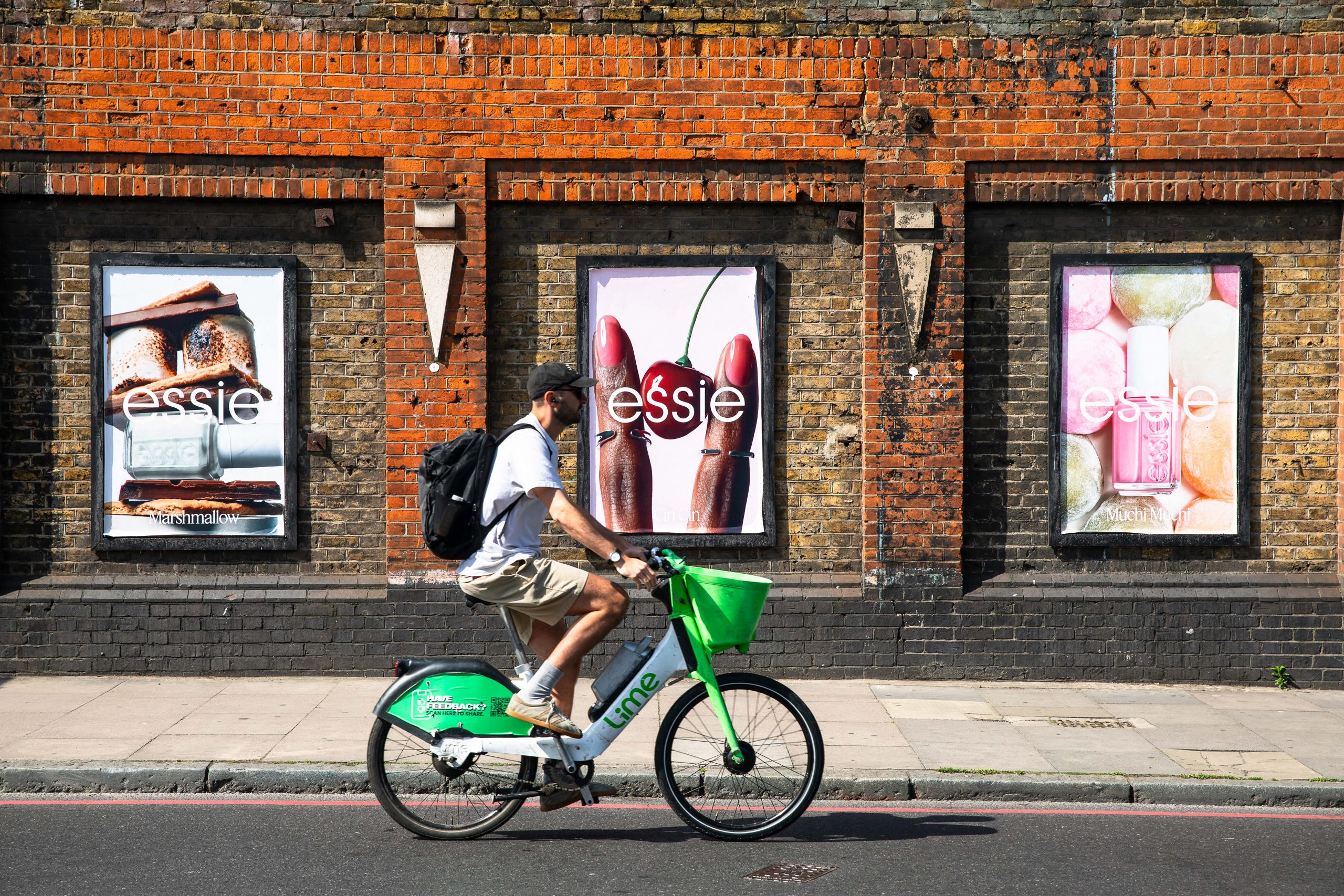
The new creative platform, Cheeky Luxury, gives the positioning a more expressive form.
Luxury beauty traditionally communicates through polish, restraint and aspiration.
Essie adds a twist.
The brand wants the elevation without becoming distant.
The result is a visual and verbal territory that can feel sophisticated while still being playful, accessible and self-aware.
Why nail beauty naturally fits this idea
Nails occupy an interesting space in beauty culture.
A manicure can feel luxurious, but it is also part of everyday self-expression.
It can signal mood, season, identity or occasion without requiring a dramatic transformation.
That makes Essie's new positioning especially believable.
The category already lives between aspiration and accessibility.
The fresh manicure as cultural ritual
The back-to-school and back-to-work moment gives the brand a useful behavioral truth.
People often mark transitions through small acts of renewal.
- A haircut.
- New clothes.
- A cleaned-up routine.
- A fresh manicure.
Essie can own that last ritual naturally.
OOH can make the rebrand feel immediate
A new positioning can remain abstract if consumers only encounter it through a press release or website update.
OOH gives the rebrand public scale.
A large-format campaign can show audiences, in seconds, what the new Essie feels like.
The media can communicate:
- Premium visual restraint.
- Recognizable color.
- Confident product styling.
- Short, cheeky copy.
That combination can make the new platform visible before the audience has consciously processed the repositioning.
Color remains one of Essie's strongest assets
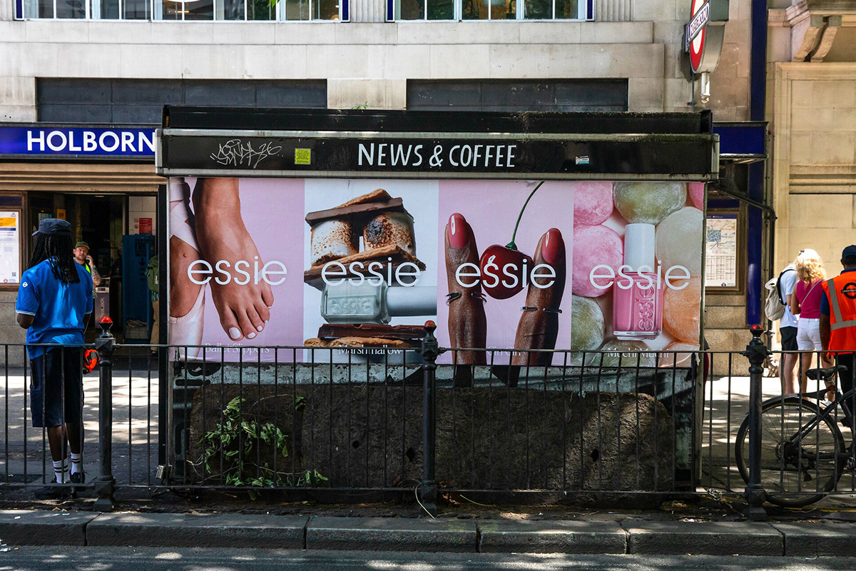
Essie has a major advantage in OOH: color is already central to the product.
The campaign does not need to invent a new visual code.
It can elevate the existing one.
Individual shades can dominate entire placements.
The familiar bottle can act as a recognizable product silhouette.
And different executions can rotate by color while remaining part of the same system.
The bottle can become an icon
Essie's bottle shape is another useful distinctive asset.
In outdoor media, that form can be enlarged, simplified and used almost like a logo.
A single bottle at massive scale can communicate both product and brand with minimal explanation.
This is especially useful during a rebrand because it preserves familiarity while introducing new styling around it.
Luxury cues without losing accessibility
The challenge for Cheeky Luxury is avoiding two extremes.
Too much luxury language could make Essie feel less approachable.
Too much playfulness could weaken the elevation.
OOH can help balance the two through composition.
Premium photography, generous negative space and refined typography can establish sophistication.
A playful headline or unexpected visual detail can provide the twist.
Why concise copy matters
The new platform benefits from language that feels confident rather than explanatory.
Cheeky Luxury should not require a paragraph to make sense.
Short lines can do more:
Back to polished.
Fresh start. Fresher nails.
Luxury, with better timing.
The tone should feel elevated, but never precious.
Seasonal moments create natural relevance
The back-to-school and back-to-work period is useful because it already carries the language of reset.
Consumers are returning to routines, wardrobes, offices and classrooms.
A new manicure fits that emotional moment.
The campaign does not need to manufacture urgency.
The calendar supplies it.
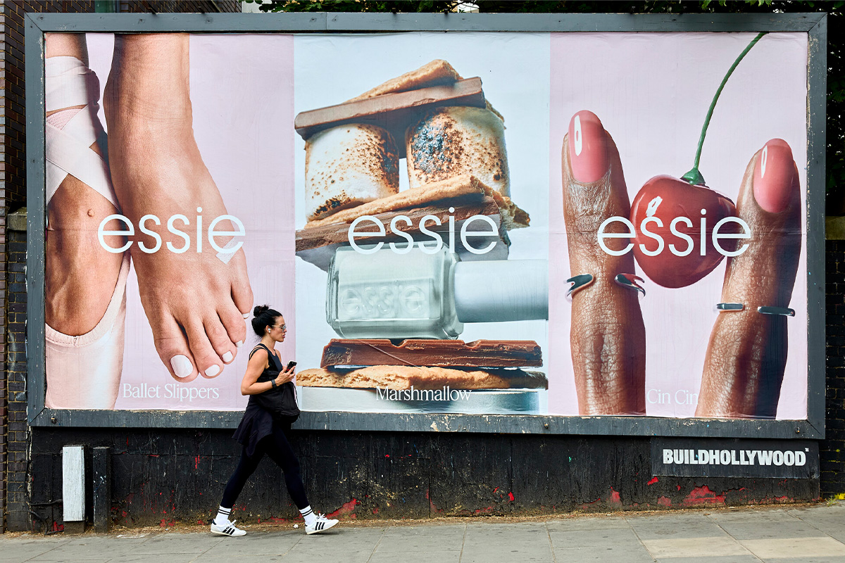
Transit and commuter OOH are a natural fit
If the message is about returning to work or routine, transit environments can add contextual relevance.
Commuters are literally moving back into daily patterns.
That makes the media location part of the message.
- Transit builds repeated exposure.
- Street-level media reaches people close to retail.
- DOOH can rotate seasonal shades.
- Premium landmarks can give the rebrand scale.
Retail proximity can complete the journey
Beauty OOH becomes even more useful when it appears close to stores where the product is available.
The audience may first see the new Essie visual language in public space and then recognize the same colors, typography and bottle on shelf.
That repetition connects brand building with purchase behavior.
A rebrand should feel coherent across every touchpoint
Essie's challenge is not only to launch a new campaign.
It is to make the new identity feel consistent across packaging, retail, social, digital and OOH.
Outdoor media can act as the most public test.
If Cheeky Luxury works at billboard scale, it is likely strong enough to work almost anywhere.
Frequently asked questions
What is Essie's new positioning?
Essie's new positioning is Elevated nail beauty with a twist, designed to bring more premium beauty sensibility into the brand while preserving its approachable and playful character.
What is Cheeky Luxury?
Cheeky Luxury is Essie's new creative platform, combining the visual and emotional codes of luxury beauty with humor, accessibility and everyday nail rituals.
Why is back-to-school and back-to-work season relevant?
A fresh manicure is a familiar reset ritual for many consumers, making seasonal return moments a natural context for reinforcing Essie's cultural role.
How could the rebrand translate into OOH?
OOH can use Essie's distinctive colors, bottle silhouette, concise cheeky copy and premium visual styling to make the new positioning feel both elevated and immediately recognizable.
Plan your OOH campaign
Get recommendations for markets, formats and availability based on your campaign goals.
Request a media plan
Comments
Share your take. Keep it constructive and specific.