
Quick take: Converse’s “Keep Making” campaign takes the brand’s iconic star and gives it a physical presence—an ordinary character moving through the city—positioning Converse as a symbol of creativity, individuality, and everyday self-expression.
Some brands protect their logos like museum artifacts. Converse did the opposite: it set its icon loose in the real world.
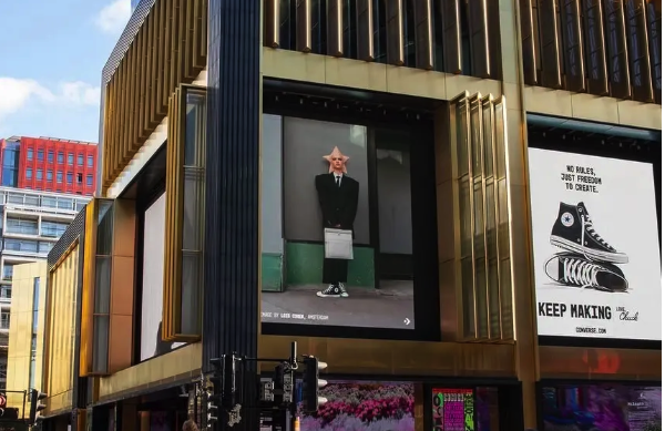
In “Keep Making”, the star that has lived on Converse branding for decades doesn’t stay as a graphic. It becomes a character—walking streets, waiting for transit, blending into the city like anyone else. The result is a campaign that feels surreal at first glance, then surprisingly human the longer you look.
The star leaves the logo — and starts living like a person
The campaign features a figure with a star-shaped head captured in everyday urban moments: walking, waiting, moving, existing. There’s no big cinematic staging or artificial “ad world” environment. It’s street-level, observational, and quiet.
That choice matters because it makes the idea feel real.
The character isn’t posed as a superhero. It’s not selling. It’s simply present—like a living symbol navigating a city that doesn’t stop to explain itself.
From brand mark to human metaphor
Converse has always had cultural shorthand: the Chuck Taylor All Star, the DIY spirit, the idea that style is personal rather than polished. The star is part of that legacy—one of the most recognizable brand symbols in sneaker culture.
But symbols can become static over time. They can turn into nostalgia. This campaign avoids that trap.
By placing the star in raw, ordinary environments, Converse shifts the symbol’s meaning:
- not a historical badge
- not a retro reference
- but a living reflection of real people who create, experiment, and keep going
It’s heritage without being stuck in the past.
Why the visual style feels so aligned with street culture
The craft of the imagery is intentionally imperfect—more tactile than digital, more physical than polished. The character’s presence feels handmade, like something built by artists rather than generated by software.
That kind of real-world texture is crucial in street-facing media. It doesn’t feel like a brand trying to imitate culture—it feels like a brand inviting culture to reinterpret it.
And the city becomes a collaborator, not just a backdrop.
“No rules, just freedom to create” — a message that doesn’t feel like marketing
The posters carry a simple line: “no rules, just freedom to create.”
The power of the message is that it isn’t product-centered. It’s identity-centered.
Converse isn’t saying: “Buy this sneaker.”
It’s saying: “Your creativity counts—even if it’s messy, weird, unfinished, or imperfect.”
That’s why the campaign can live in OOH and print so naturally. Outdoor rewards ideas that read fast and hit emotionally. Print reinforces the tone like a manifesto—quiet confidence, no forced explanation.
The deeper idea: everyone can be an All Star
Converse’s most iconic phrase, “All Star,” has always been bigger than athletics. It’s about self-definition.
By making the star walk around like a normal person, the campaign makes a simple point: creativity isn’t reserved for professionals. It belongs to anyone willing to keep making.
What brands can learn from this campaign
1) Icons don’t have to stay fixed
Brand symbols can evolve without losing heritage—if the transformation feels culturally true.
2) Surreal concepts work best when the setting is real
The more ordinary the environment, the more believable the weird idea becomes.
3) OOH is a perfect stage for character-driven brand worlds
Outdoor is public. A public-facing brand symbol becomes instantly shareable when it appears “in the wild.”
4) Don’t sell the product—sell the philosophy
When the brand already has recognition, meaning can outperform features.
Comments
Share your take. Keep it constructive and specific.