
Cokesticks: How Coca-Cola Turned a Bottle Into a Branding Masterclass
In a media landscape crowded with messages, simplicity can be one of the most powerful creative tools. Coca-Cola's Cokesticks campaign demonstrates exactly why.
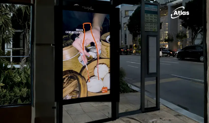
The concept is remarkably straightforward. The campaign reimagines Coca-Cola's famous contour bottle as a pair of chopsticks, creating an unexpected visual connection between one of the world's most recognizable product designs and dining culture.
There is no lengthy explanation, no elaborate copywriting, and almost no visible branding. Yet the message is instantly understood.

The Power of an Iconic Shape
What makes Cokesticks remarkable is not the complexity of the execution but the confidence behind it.
Many brands rely heavily on logos, slogans, and product photography to ensure recognition. Coca-Cola takes the opposite approach, trusting one of its strongest assets: the contour bottle.
The silhouette alone carries enough equity to communicate the brand without additional support.

A Design Asset That Travels Across Contexts
One of the most difficult challenges in branding is maintaining recognition when creative executions move into unfamiliar territory.
Cokesticks succeeds because the contour bottle remains instantly identifiable even after being transformed into something completely different.
The campaign places Coca-Cola within a dining context, using chopsticks as the visual bridge. Despite the shift in meaning, the connection to the brand remains immediate.
This flexibility is one of the hallmarks of a truly distinctive brand asset.
Less Branding, More Recognition
Many marketers aspire to reach a point where consumers recognize their brand before seeing a logo.
Coca-Cola has spent decades building the consistency required to achieve exactly that.
The contour bottle, combined with the brand's distinctive color palette and visual language, has become one of the strongest identifiers in global marketing.
Cokesticks demonstrates what happens when a company fully trusts those assets.
- No product shot is required.
- No logo dominates the design.
- No headline explains the idea.
- Recognition happens almost instantly.
The Real Value of Brand Equity
The campaign serves as a reminder that brand equity is built over years, not individual campaigns.
Every consistent use of a distinctive asset strengthens future recognition. Over time, those assets accumulate meaning, familiarity, and emotional connection.
For Coca-Cola, decades of investment have transformed a bottle shape into a communication platform capable of carrying an entire campaign.
That's the ultimate goal of brand-building: creating symbols so recognizable that they communicate independently.

What Brands Can Learn From Cokesticks
The campaign offers a valuable lesson for marketers focused on long-term brand growth.
Many brands spend significant resources chasing short-term visibility while underinvesting in distinctive assets that create lasting recognition.
Cokesticks shows the opposite approach. Instead of introducing something entirely new, Coca-Cola extracts more value from an asset it already owns.
The result is creative work that feels fresh while reinforcing decades of brand equity.
- Invest in distinctive visual assets.
- Use them consistently over time.
- Allow recognition to do some of the communication work.
- Trust simplicity when the asset is strong enough.
Bottom Line
Cokesticks is more than a clever visual idea. It is a demonstration of what happens when a brand owns an asset so recognizable that it can evolve into entirely new forms while remaining unmistakably itself.
By transforming its contour bottle into chopsticks, Coca-Cola proves that the strongest brands do not always need more messaging. Sometimes, they simply need the confidence to let their identity speak for itself.
Plan your OOH campaign
Get recommendations for markets, formats and availability based on your campaign goals.
Request a media plan




Comments
Share your take. Keep it constructive and specific.