
Quick take: BIC’s Inkredible campaign reframes the Cristal Original pen as a design and performance icon: unchanged since 1950, capable of writing up to 3km, sold in the billions, and recognized by MoMA as part of its permanent collection.
There are products that evolve every year—and then there are products that never needed to.
BIC’s Cristal Original belongs to the second category. In a market obsessed with “new,” it has spent decades proving that consistency can be its own kind of innovation. That’s the story behind “Inkredible”: not a reinvention, but a reminder that one of the world’s most common objects is also one of the most impressive.
Why the Cristal Original still matters in 2026
The Cristal isn’t relevant because it’s nostalgic. It’s relevant because it’s still useful—at massive scale.
The pen has remained essentially unchanged since 1950, and that longevity is the strongest possible product review: it means the design solved its job so well that it didn’t need constant upgrades to stay in people’s hands.
The campaign’s smartest move: letting facts do the selling
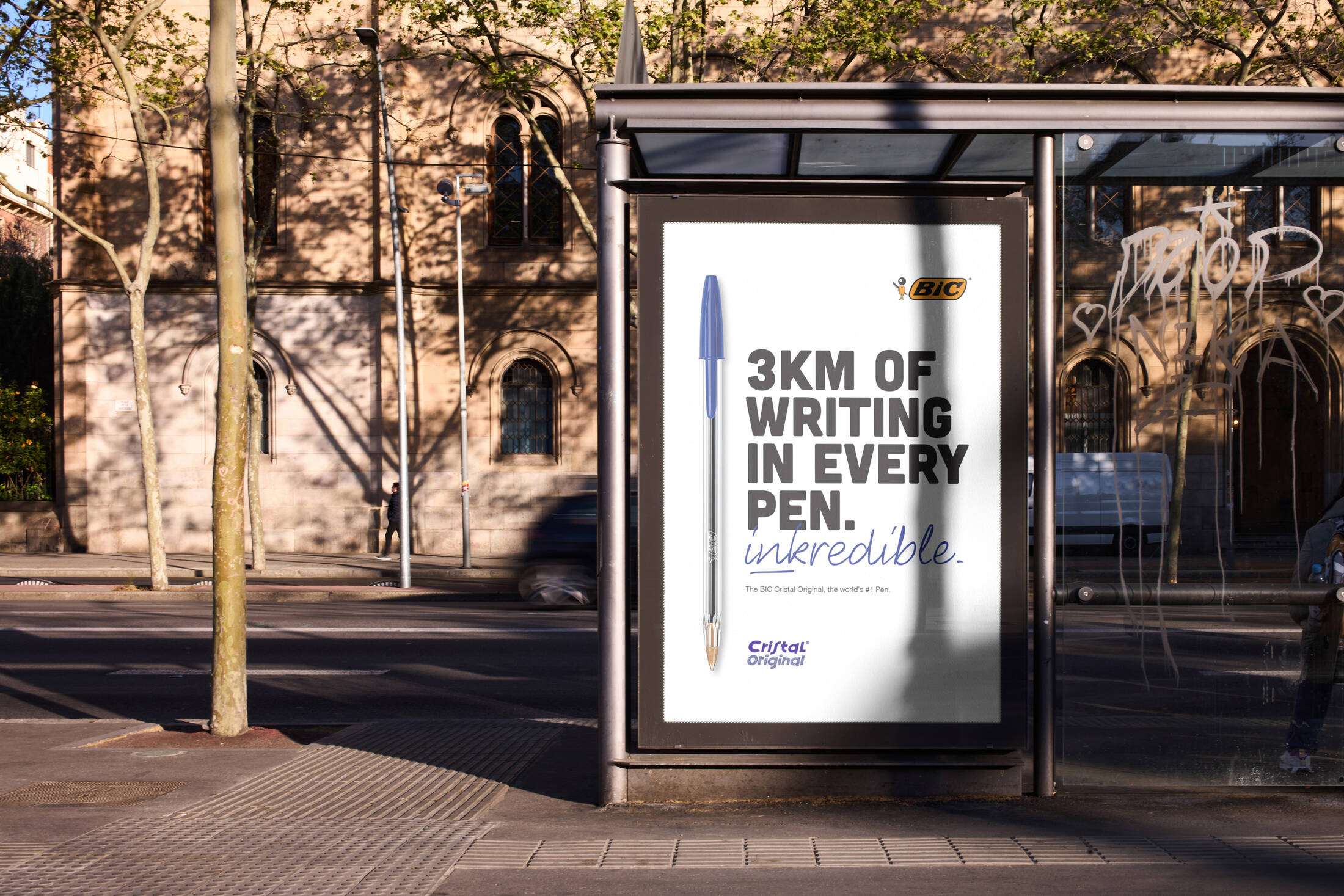
Many campaigns manufacture meaning. Inkredible does the opposite—it pulls meaning directly from measurable truths.
The creative revolves around a handful of facts that are already remarkable:
- Up to 3km of writing in a single pen
- A design unchanged since 1950
- Billions sold globally
- Recognized as a design icon through inclusion in MoMA’s permanent collection
Instead of dressing the product up with flashy storytelling, the campaign treats those numbers like headlines—turning everyday reliability into something worth noticing.
This is what makes it feel powerful: the message doesn’t exaggerate. It simply reframes what was already true.
From disposable object to cultural artifact
One of the strongest creative pivots in Inkredible is the MoMA reference. It instantly upgrades perception.
Most people think of the Cristal as a “cheap pen.” The campaign asks you to see it differently: as a piece of design that earned a place in the same cultural spaces as far more celebrated objects.
That bridge—between ordinary utility and recognized design heritage—creates a new kind of pride around a product people already use.
OOH + Print makes perfect sense here
This idea works especially well in OOH and print because the product itself is universal. Everyone understands pens. Everyone has used one. No explanation is needed.
OOH gives the campaign:
- Immediate visibility
- Simple, bold statements that feel like “public facts”
- A classic medium match for a classic object
Print reinforces the same message with a tactile, no-frills credibility that fits the Cristal’s identity: functional, direct, timeless.
What marketers can learn from “Inkredible”
1) Product truth can be the whole creative
If the proof is strong, you don’t need extra mythology.
2) Consistency can be positioned as innovation
Not every brand wins by changing. Some win by being dependable.
3) OOH is perfect for fact-based storytelling
Short, bold statements land harder when they feel like public record.
4) Icons don’t always look premium
Sometimes the most “premium” thing is a design that never fails.
Comments
Share your take. Keep it constructive and specific.